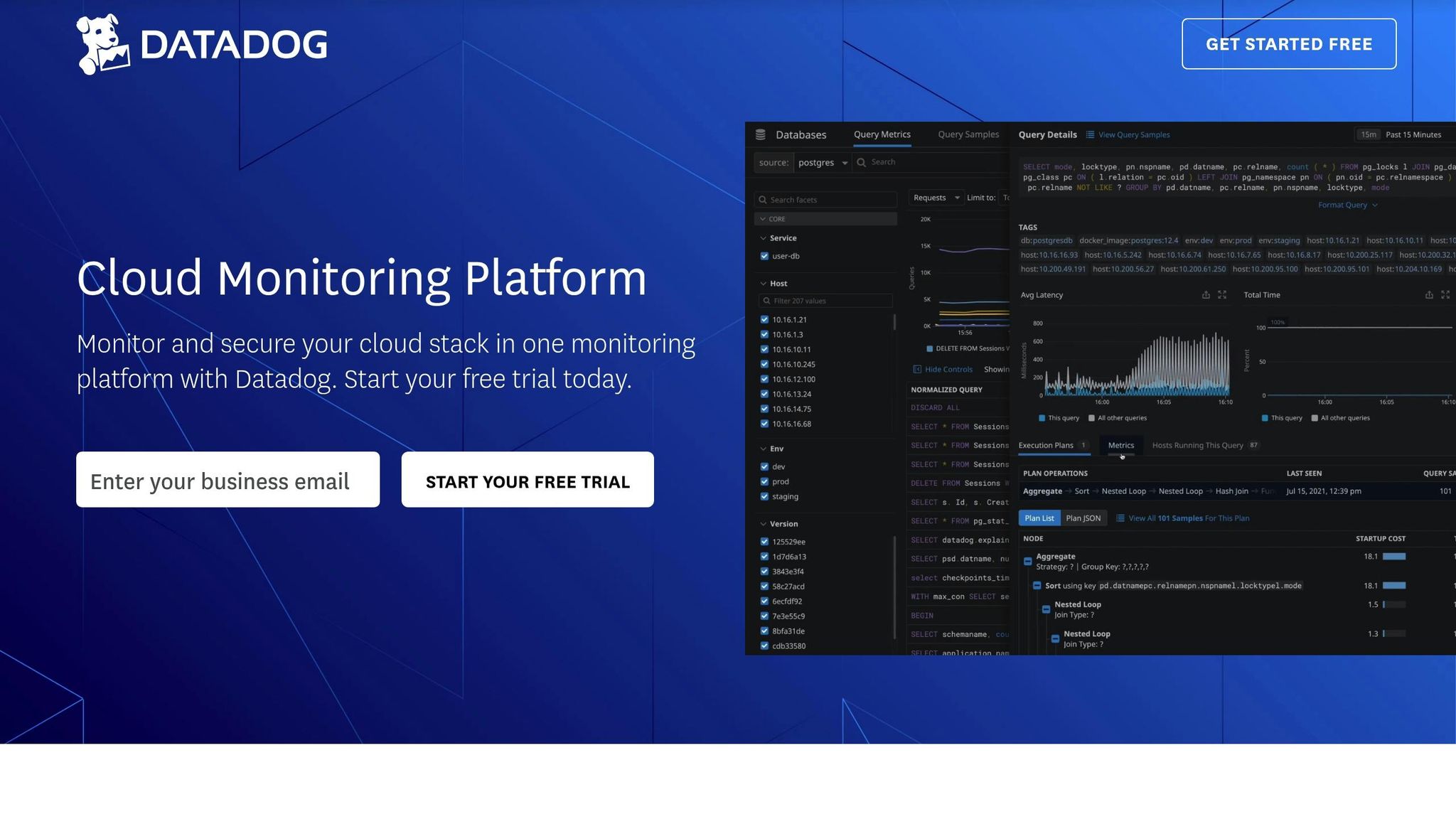
Datadog Dashboards: Customization Tips for SMBs
Learn how SMBs can optimize Datadog dashboards with effective customization strategies for better monitoring and performance tracking.
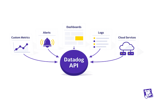
Datadog dashboards help small and medium-sized businesses (SMBs) track performance efficiently by centralizing key metrics in one place. Here's what you need to know:
- Dashboard Types: Use Screenboards for visual overviews and Timeboards for time-based troubleshooting.
- Key Widgets: Choose from tools like Timeseries for trends, Query Values for critical metrics, and Heat Maps for patterns.
- Organize Smartly: Place critical data at the top, group related metrics, and use color coding for clarity.
- Save Time: Create reusable templates with variables to switch between environments or services easily.
- Real-Time Alerts: Add alert displays with clear thresholds and visual cues to spot issues quickly.
By customizing dashboards with the right widgets, layout, and filters, SMBs can monitor systems effectively without overloading their teams.
Quick Tip: Use tags like env:production or team:backend to refine data views and focus on what's important.
Create your Dashboard in under 5 Minutes!
Getting Started with Datadog Dashboards
To create effective Datadog dashboards, it's important to understand their basic components. For small and medium-sized businesses (SMBs), mastering these elements ensures dashboards provide actionable insights right away. Below, we'll break down the key elements that make monitoring with Datadog dashboards effective.
Dashboard Building Blocks
Datadog offers two main types of dashboards, each tailored for specific monitoring purposes:
- Screenboards: Great for creating multimedia-rich, customizable overviews.
- Timeboards: Ideal for troubleshooting, focusing on time-based data correlations.
Here are the core visualization tools you’ll use when building dashboards:
| Widget Type | Best Used For | Key Benefits |
|---|---|---|
| Timeseries | Tracking metric changes over time | Highlights performance trends effectively |
| Line Graphs | Comparing single metrics | Displays data across different scopes |
| Heat Maps | Analyzing large-scale metrics | Identifies patterns across multiple groups |
| Query Values | Monitoring critical metrics | Features conditional formatting for clarity |
| Host Maps | Viewing infrastructure status | Offers a high-level snapshot of system health |
To enhance your dashboards, use Notes and Links widgets to separate sections clearly. Add markers to graphs to define ideal metric ranges - this helps team members quickly identify when something is off.
How SMBs Benefit from Custom Dashboards
Custom dashboards allow SMBs to focus on the metrics that matter most, improving monitoring efficiency without overburdening resources.
Here are some strategies to make the most of your dashboards:
- Choose the Right Widgets: Pick widgets that align with your goals. For example, use Top Lists to identify outliers or Change graphs to track metric variations over time.
- Organize Visually: Keep formatting consistent, use conditional highlights for key data points, group related widgets strategically, and include clear section headers for better readability.
- Track Performance in Real Time: Add widgets like Alert Graphs and Check Status to monitor system health and respond quickly to any issues.
Setting Up Clear Dashboard Layouts
A well-organized dashboard layout makes it easier for SMB teams to quickly identify issues and make informed decisions. Let’s look at how to arrange your dashboard for maximum clarity and efficiency.
Organizing Metrics by Priority
Strategically placing metrics is essential for a functional dashboard. Start by identifying your most important performance indicators and position them at the top. This "top-down" arrangement ensures critical information is front and center.
| Dashboard Zone | Content Type | Purpose |
|---|---|---|
| Top Section | Critical alerts & KPIs | Quick view of system health |
| Middle Section | Performance trends | Insights into historical data and trends |
| Bottom Section | Detailed metrics | Deep dive for analysis and troubleshooting |
Group related metrics logically - for instance, keep database metrics together and separate them from application response times.
To improve readability:
- Use color-coded widget groups for easier scanning.
- Add descriptive headers for clarity.
- Maintain adequate spacing between groups to avoid clutter.
Once your metrics are organized, you can move on to creating reusable templates for consistent setups.
Creating Reusable Dashboard Templates
Reusable dashboard templates save time and ensure a consistent structure across different environments. Here’s how to create and use templates effectively:
1. Base Template Structure
Design a basic template that includes:
- Standardized widget layouts
- Placeholder sections for easy customization
- Pre-configured time range controls
- Common alert displays for quick setup
2. Template Variables
Use template variables to make your dashboards more flexible. These can help you:
- Switch between environments (e.g., staging, production)
- Filter data by service name or instance type
- Adjust metric scopes without starting from scratch
3. Documentation Widgets
Add widgets with notes that explain each section's purpose, provide metric interpretations, and offer troubleshooting tips. This ensures anyone using the dashboard understands its layout and functionality.
Configuring Widgets for SMB Needs
Selecting Effective Widget Types
Choose widget types that clearly present your metrics. Each widget is designed for specific monitoring tasks, making it easier to understand and analyze your data.
| Widget Type | Best Used For | Key Features |
|---|---|---|
| Time Series | Tracking performance trends, resource usage | Highlights patterns and anomalies over time |
| Status | Monitoring service health, uptime | Provides a quick visual overview of system status |
| Top List | Identifying resource consumption, error rates | Pinpoints top performers or problem areas |
| Heat Map | Analyzing request latency, traffic patterns | Displays data distribution visually |
| Query Value | Showcasing key metrics | Highlights current values prominently |
When choosing widgets, align them with your monitoring objectives. For instance, use Time Series widgets to observe CPU usage trends, while Status widgets are ideal for showing the real-time health of your services.
Tips for optimizing your dashboard:
- Place critical metrics in Query Value widgets at the top for quick access.
- Use Heat Maps to visualize latency across your services.
- Leverage Top List widgets to track high-resource consumers or error hotspots.
- Add Status widgets to monitor the health of essential systems at a glance.
Using Tags and Filters
Once you've chosen the right widgets, refine your dashboard by applying tags and filters. These tools help you focus on the most relevant data, making it easier to manage and analyze metrics across your infrastructure.
Building a Tagging Strategy That Works
A solid tagging system is essential for effective filtering. As Datadog explains, "Tags are key to modern monitoring because they allow you to aggregate metrics across your infrastructure at any level you choose".
Here’s how to set up your tags:
1. Standard Infrastructure Tags
Start with these core tags for all services:
env:(e.g., production, staging, development)service:(e.g., app name or function)team:(e.g., responsible team or group)priority:(e.g., business impact level)
2. Custom Business Tags
Include tags that reflect your unique business needs. For example:
service:web-store
env:shop.ist
resource_name:shoppingcartcontroller_checkout
severity:high
team:backend
sli:throughput
3. Applying Filters
Use filters to narrow down the data displayed in your widgets. For example:
- Focus on live systems by filtering with
env:production. - Isolate metrics for a specific application using
service:web-store. - View backend-specific performance by applying
team:backend.
Additionally, integrate the Service Catalog to document service ownership and contact details. This step ensures clear accountability and helps streamline incident response.
For environments that change frequently, configure template variables in your widgets. These variables allow you to switch views easily and reuse dashboard setups without losing flexibility in your monitoring.
Advanced Dashboard Features
Working with Template Variables
Template variables turn static dashboards into flexible tools for monitoring. They allow you to filter data across your infrastructure quickly, making it easier for small teams to troubleshoot.
-
Use Variables in Queries: Insert variables like
$tempvar.valueinto queries. For example:service:$service.value AND env:production. -
Simplify with Partial Matches: Reduce complexity by matching parts of strings:
service:web-store-* AND env:$environment -
Combine Legacy and New Tags: Write inclusive queries for backward compatibility:
service:($old_service.value OR $new_service.value)
Once you've set up dynamic filtering, you can refine your monitoring further by adjusting time range controls.
Setting Time Range Controls
Time range controls let you switch between real-time monitoring and analyzing longer trends. Here's a quick guide:
| Time Window | Use For | Benefits |
|---|---|---|
| Last 15 minutes | Real-time monitoring | Catch issues as they happen |
| Last 24 hours | Daily patterns | Understand daily performance |
| Last 7 days | Weekly trends | Plan for capacity changes |
| Custom ranges | Specific investigations | Focus on specific incidents |
Set default ranges that align with your service goals. Add comparison views to track changes over time, such as week-over-week metrics. Shorter windows are ideal for spotting frequent issues, while longer ones help in capacity planning.
Adding Alert Displays
Once your time ranges are set, improve your dashboard by adding clear and well-organized alert displays.
- Prioritize Layout: Place high-priority alerts at the top of your dashboard for easy visibility. Group related alerts to provide context.
-
Set Alert Thresholds: Define thresholds that match your business needs:
Warning: CPU > 70% Critical: CPU > 90% - Use Visual Cues: Add color coding for clarity - green for normal, yellow for warnings, and red for critical alerts.
Pro Tip: With DASH 2025 coming up in NYC (June 10-11), take this opportunity to refine your dashboards. You'll be better prepared to share insights with other SMB users and Datadog experts.
These features help small teams quickly identify issues and keep systems running smoothly.
Conclusion: Steps to Improve Your Dashboards
Take your SMB dashboards to the next level with these practical steps:
Prioritize Visual Clarity and Easy Navigation
Use widgets that present key metrics in a straightforward way. Graph markers can highlight acceptable ranges or critical thresholds, making it simple for your team to assess system status at a glance. Add an overview section at the top of your dashboard, and use Notes and Links widgets to organize content with clear headers.
Select the Right Dashboard Type
Match the dashboard type to your specific needs: Screenboards for visual reporting, Timeboards for troubleshooting, and Host Maps for infrastructure monitoring.
Review and Update Regularly
Set up a monthly review process to remove redundant widgets, combine similar metrics, and adjust thresholds as your infrastructure changes. This ensures your dashboards stay relevant and effective.
Use Advanced Features
Take advantage of tools like template variables for flexible filtering and the JSON editor for deeper customization. Add conditional formatting to Query Value widgets to make metric statuses instantly clear using color coding.
FAQs
How can small and mid-sized businesses (SMBs) use tags and filters in Datadog dashboards to improve data analysis?
SMBs can use tags and filters in Datadog dashboards to organize and refine their data for better monitoring and faster insights. Tags, which are simple key:value pairs, help categorize and group data, making it easier to focus on specific services, environments, or locations. Filters allow users to narrow down displayed metrics, ensuring dashboards show only the most relevant information.
For example, you can tag hosts and services by function, role, or location to quickly switch views and analyze performance from different perspectives. Advanced filtering options, such as boolean syntax (e.g., AND, OR, NOT), enable precise control over which data points are included or excluded. Additionally, template variables can save time by letting you adjust filters across multiple widgets at once, streamlining the analysis of different services or environments.
By applying tags consistently across metrics, logs, and traces, SMBs can connect data points, troubleshoot issues faster, and gain a clearer understanding of how their systems work together. This approach enhances visibility and simplifies decision-making for system monitoring and performance analysis.
How do template variables in Datadog dashboards help SMBs enhance monitoring and simplify troubleshooting?
Template variables in Datadog dashboards allow SMBs to dynamically filter and customize views based on specific criteria like hosts, containers, or services. This flexibility makes it easier to focus on the most relevant data, speeding up troubleshooting and improving overall monitoring efficiency.
By enabling the creation of reusable and shareable dashboards, template variables streamline workflows and adapt seamlessly to various use cases. Additionally, automatically generated associated values help users quickly pinpoint the most relevant data, making it simple to isolate and analyze key metrics without unnecessary complexity. This feature empowers SMBs to gain actionable insights faster and make better-informed decisions.
How can SMBs keep their Datadog dashboards relevant and effective as their needs evolve?
To keep Datadog dashboards relevant and effective, SMBs should regularly review and update them to align with changing business priorities. Start by evaluating the metrics displayed and removing any outdated or unnecessary data, ensuring the focus remains on actionable insights.
Take advantage of Datadog's customization features like widget configuration, flexible layouts, and data filtering to tailor dashboards to your specific needs. Using template variables can also make dashboards more adaptable, allowing you to quickly switch views based on data centers, regions, or other key parameters.
Finally, organize widgets logically and use grouping or links to improve navigation and streamline analysis. This ensures your team can quickly identify trends, address issues, and make informed decisions without unnecessary complexity.