Interactive Dashboard Widgets in Datadog
Learn how interactive widgets in cloud monitoring tools can simplify performance tracking and enhance resource management for SMBs.
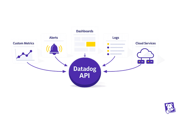
Datadog's interactive widgets make monitoring your cloud systems simple and actionable. These tools help you track performance, manage resources, and detect issues in real time - perfect for small and medium-sized businesses (SMBs) without large monitoring teams.
Key Features:
- Real-time insights: Spot and fix problems quickly.
- Customizable displays: Focus on metrics that matter most.
- Widget types: Time series, heat maps, logs, tables, and more.
- Advanced tools: Alerts, historical comparisons, and template variables for dynamic dashboards.
Quick Overview of Widget Types:
| Widget Type | Best Use Case | Key Benefit |
|---|---|---|
| Time Series | Trend Analysis | Understand performance over time. |
| Metric | KPI Monitoring | Quick status updates. |
| Distribution | Pattern Analysis | Detect anomalies. |
| Heat Map | Resource Usage | Identify bottlenecks. |
| Service View | Architecture Overview | Visualize system dependencies. |
With Datadog widgets, you can create dashboards that are tailored to your needs, helping you monitor system health, track KPIs, and manage costs efficiently. Keep reading to learn how to set up and optimize dashboards for your business.
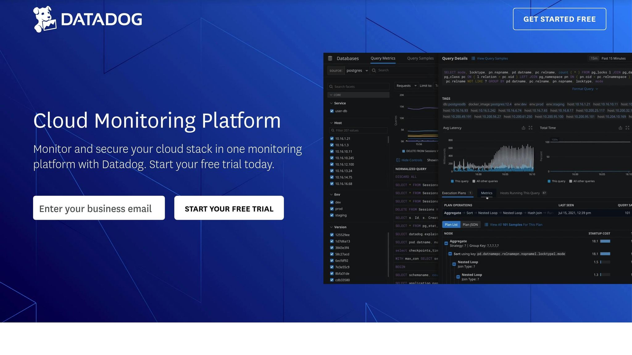
I06 Build Datadog Dashboards That Actually Help During ...
Common Widget Types
Datadog's interactive widgets simplify complex data, turning it into actionable insights. Each widget type is designed to highlight specific aspects of your system's performance.
Time Series and Metrics
Time series widgets are perfect for visualizing how metrics change over time. You can choose from several styles:
- Line graphs: Monitor metric trends over time.
- Area charts: Show cumulative metrics and resource usage.
- Bar graphs: Compare data across distinct time intervals.
Metric widgets, on the other hand, provide quick snapshots of key performance indicators (KPIs). These can be customized to display:
- Current values.
- Percentage changes compared to earlier periods.
- Threshold indicators to flag potential issues.
Lists, Tables, and Distributions
Lists and tables present data in an organized format, making it easy to compare metrics across system components. They are commonly used for:
- Ranking host performance.
- Comparing resource usage.
- Summarizing service statuses.
Distribution widgets offer a view of how metrics are spread across your infrastructure. They’re especially helpful for:
- Analyzing response time percentiles.
- Identifying resource consumption trends.
- Understanding error rate patterns.
Logs, Heat Maps, and Service Views
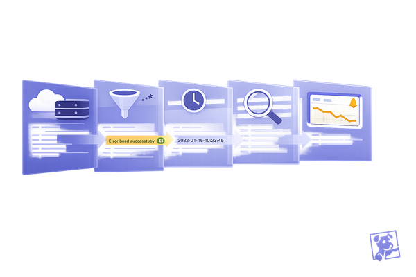
Log widgets allow you to stream real-time log data directly to your dashboard, making it easier to detect issues as they happen. Features include:
- Live log updates.
- Pattern recognition.
- Highlighting anomalies.
Heat maps provide a density-based view, ideal for identifying:
- Daily traffic patterns.
- Resource usage hotspots.
- Performance bottlenecks.
Service view widgets map out the relationships between your system's components. These widgets help with:
- Visualizing dependencies.
- Monitoring service health.
- Tracking traffic flows.
| Widget Type | Best Use Case | Key Benefit |
|---|---|---|
| Time Series | Trend Analysis | Understand historical performance. |
| Metric | KPI Monitoring | Quick status updates. |
| Distribution | Pattern Analysis | Spot system behavior anomalies. |
| Heat Map | Resource Usage | Identify usage trends and bottlenecks. |
| Service View | Architecture Overview | See system dependencies clearly. |
Dashboard Setup Guide
Once you're familiar with widget types, it's time to set up your dashboard for actionable insights.
Template variables allow you to filter dashboard data dynamically. These variables can include options like host variables, service tags, environment selectors, and team identifiers, helping you tailor the dashboard to your needs.
Types of Template Variables
- Host variables
- Service tags
- Environment selectors
- Team identifiers
Tips for Creating Effective Template Variables
- Define a broad scope: Ensure the variables apply across multiple widgets for better flexibility.
- Set default values: Choose defaults that display meaningful data right away.
- Establish dependencies: Create logical relationships between variable selections for smoother filtering.
After setting up your template variables, focus on refining the dashboard layout to improve how data is displayed. This step ensures your insights are easy to interpret at a glance.
Advanced Features
Building on the basics of dashboard setup, these features take your data analysis to the next level.
Formatting Rules and Calculations
Use conditional formatting and calculations to make key metrics stand out. For example, configure timeseries widgets to display CPU usage above 80% in red:
avg:system.cpu.user{*}.rollup(avg, 60) > 80
For IoT monitoring, you can combine data points to calculate device efficiency. Here's an example formula:
(sum:device.data_ingested{*}.as_count() / sum:device.errors{*}.as_count()) * 100
You can also integrate alerts and annotations to enable real-time responses.
Alert and Note Integration
With Opsgenie integration, widget statuses update instantly when alerts are acknowledged. Create annotations that guide action, like this:
@opsgenie-acknowledge Alert triggers when error_rate{env:prod} exceeds 5% for 10 minutes – contact SRE team
These integrations help you connect real-time alerts with historical data for deeper insights.
Historical Data Comparison
Compare current metrics against historical data using Change Graphs and the timeshift operator. This approach helps you spot trends more easily.
| Comparison Type | Retention Period | Use Case |
|---|---|---|
| Short-term | 30–90 days | Identify daily or weekly patterns |
| Long-term | 15 months | Analyze seasonal trends |
| Real-time | Current | Monitor live data |
Focus on the metrics that matter most to your business. Keep timeshift ranges within 30 days to ensure your dashboard stays fast and responsive.
SMB Dashboard Design
Tracking Business Metrics
Design widgets that reflect your key performance indicators (KPIs). Combine multiple data points into custom widgets to gain a clearer understanding of your metrics.
For example, track user engagement by comparing active users to error rates with this query:
avg:users.active{*}.rollup(avg, 300) / avg:errors.count{*}.rollup(avg, 300)
Organize your metrics into these main categories:
| Category | Key Metrics | Widget Type |
|---|---|---|
| Customer Experience | Response time, Error rates, Availability | Time series |
| Infrastructure | CPU, Memory, Network throughput | Heat maps |
| Business Impact | Transactions, Hourly revenue, Active users | Top lists |
| Cost Management | Resource utilization, Cloud spend, Storage usage | Query value |
While these widgets provide operational insights, executive dashboards should focus on summarizing performance for a broader overview.
Management Dashboards
For management dashboards, focus on turning metrics into actionable insights. Include elements that help executives quickly assess and respond to key issues.
Here are some essential components to include:
| Component | Purpose | Update Frequency |
|---|---|---|
| Summary widgets | Provide a high-level status overview | Real-time |
| Trend analysis | Compare week-over-week performance | Daily |
| SLA compliance | Track service level agreements | Hourly |
| Cost metrics | Monitor resource usage vs budget | Daily |
Focus on metrics that are actionable. Use conditional formatting to highlight critical issues - for instance, flagging response times over 200ms in red to signal potential customer experience problems.
Dashboard Performance
After designing and setting up your dashboard, shift your focus to optimizing its performance to ensure real-time responsiveness.
1. Query Optimization
Use efficient queries to reduce load times. For instance:
sum:transactions.count{env:production,service:payment}
2. Widget Configuration
Prioritize critical metrics by placing them at the top and set refresh rates based on how often the data changes:
| Data Type | Refresh Rate | Memory Impact |
|---|---|---|
| Real-time metrics | 30 seconds | High |
| Hourly aggregates | 5 minutes | Medium |
| Daily summaries | 1 hour | Low |
To maintain responsiveness, limit dashboards to 20 widgets. For more detailed analyses, create linked dashboards instead of overloading a single view. This keeps your dashboard streamlined and efficient.
Summary
Datadog's interactive widgets give SMBs the tools they need to keep an eye on systems and adjust operations as needed. Building on the earlier setup and advanced features, these widgets offer real-time system monitoring, customizable KPI tracking, and streamlined reporting to help manage resources effectively.
| Dashboard Focus | Business Impact | Implementation Priority |
|---|---|---|
| System Health | Detects issues early | High - set up immediately |
| Business KPIs | Supports data-driven decisions | High - implement within a week |
| Cost Management | Optimizes resource use | Medium - address within a month |
| Executive Reports | Aids in strategic planning | Medium - ongoing adjustments |
Use these priorities as a guide to refine your monitoring approach. Adjust refresh rates and limit widget counts to maintain performance. Consistent upkeep and performance checks keep your widgets running smoothly and effectively.
FAQs
How can I customize widgets in Datadog dashboards to meet my business needs?
Customizing widgets in Datadog dashboards allows you to tailor your monitoring experience to align with your specific business goals. You can adjust widget settings such as data sources, visualization types (e.g., graphs, heatmaps, or tables), and filters to focus on the metrics most relevant to your operations.
To get started, open your Datadog dashboard, select a widget, and use the customization options to modify its appearance and functionality. You can also group widgets, apply time range filters, or set conditional formatting to highlight critical data points. These adjustments help ensure your dashboards provide actionable insights at a glance, improving your decision-making process.
How can I set up template variables in Datadog dashboards to improve data filtering?
To enhance data filtering in Datadog dashboards, use template variables effectively. Template variables allow you to dynamically filter and customize your dashboard views based on specific criteria, such as hosts, services, or environments.
When setting up template variables, start by identifying the key data points you'd like to filter. Use meaningful variable names and configure them to reference tags or attributes that are relevant to your infrastructure. For example, you can create variables for region, availability zone, or host type to make your dashboards more interactive and adaptable.
Additionally, test your variables to ensure they return the expected results and improve usability by organizing them logically. This way, you can quickly refine your analysis and focus on the metrics that matter most to your business.
How can I use Datadog's interactive widgets to monitor and optimize cloud resource costs effectively?
Datadog's interactive widgets allow you to visualize, monitor, and manage your cloud resources in real time, helping you identify cost-saving opportunities. By customizing widgets such as time series graphs, heatmaps, and query value displays, you can track key metrics like resource usage, billing trends, and performance anomalies.
To get started, add widgets to your dashboard that focus on cost-related metrics, such as CPU utilization, memory usage, or billing data by service. Use filters, groupings, and time ranges to drill down into specific areas of interest. For example, you can filter by service or region to pinpoint inefficiencies and take corrective action.
Interactive widgets make it easy to correlate data across multiple sources, giving you a clearer picture of your cloud expenses and enabling smarter decisions to optimize costs.