Optimizing Workflow Dependencies in Datadog
Map service relationships, detect bottlenecks, and automate fixes to improve performance, reliability, and reduce MTTR.
Managing workflow dependencies in Datadog can help you improve system performance, reduce bottlenecks, and simplify troubleshooting. By mapping relationships between services, pinpointing issues, and automating responses, you can maintain efficiency across your infrastructure.
Key Takeaways:
- Service Map: Visualize real-time connections between services to identify bottlenecks and risks.
- Request Flow Map: Monitor traffic and error rates to detect load issues and cascading failures.
- Software Catalog: Manage service ownership and metadata to improve accountability.
- Metrics Analysis: Use latency, throughput, and error rate data to find and resolve performance issues.
- Workflow Automation: Automate actions like scaling resources or restarting services to reduce manual intervention.
- Change Tracking: Link performance issues to recent deployments or updates for faster resolution.
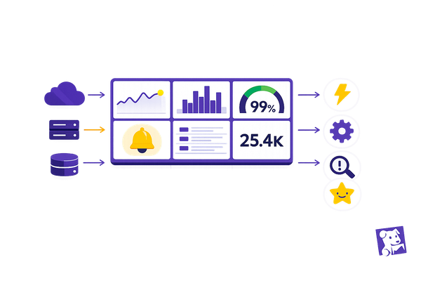
Datadog’s tools, like Dependency Map Navigator and Watchdog Insights, provide visibility into service interactions, helping you address problems before they escalate. For small and medium-sized businesses, these features can save time, cut costs, and improve customer experiences.
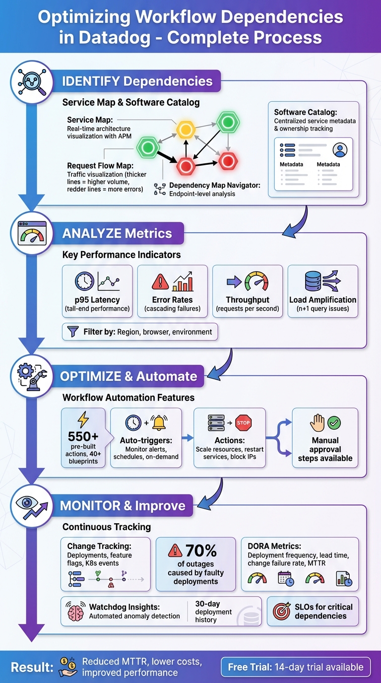
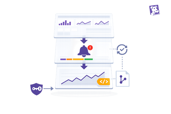
Datadog Workflow Dependency Optimization Process: 4-Step Framework
Datadog Workflow Automation Demo
How to Identify Workflow Dependencies in Datadog
Datadog offers two key tools to help you identify workflow dependencies: the Service Map, which provides real-time architecture visualization, and the Software Catalog, which documents ownership and relationships. Together, these tools give you a comprehensive view of how your services interact, making it easier to understand and optimize your workflows.
Visualizing Dependencies with Service Map
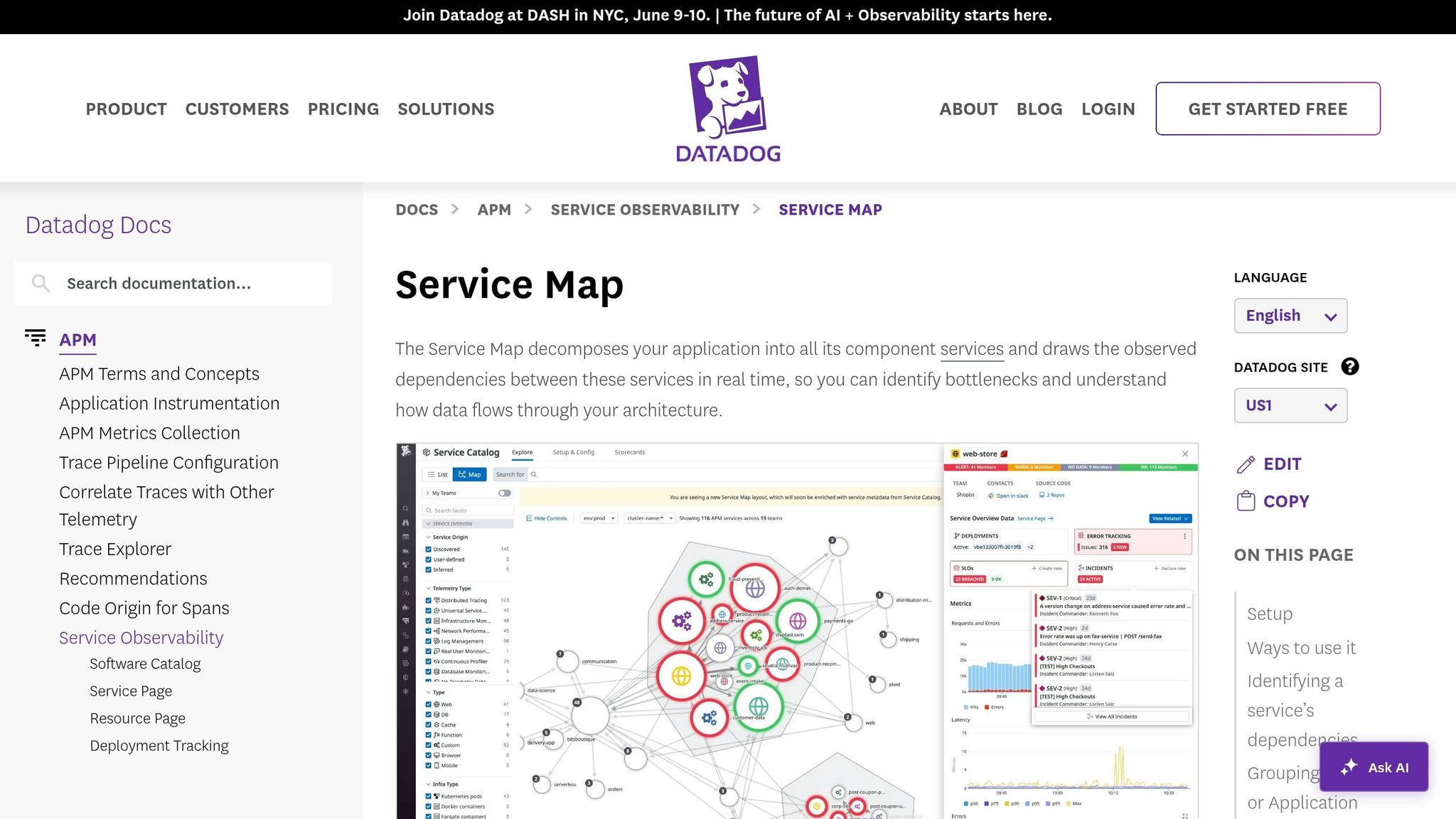
The Service Map automatically creates a real-time visualization of your application architecture using data collected by Datadog APM. If you're already using Datadog APM, no additional setup is required. This tool groups related services into clusters based on call frequency, with services at the edges often pinpointing potential bottlenecks.
Each service node on the map is marked with colored rings - green, yellow, or red - indicating its monitor status. Hovering over a node isolates its upstream and downstream dependencies, while clicking on a node provides access to traces, logs, and metrics for deeper analysis.
The Request Flow Map offers a live view of traffic between services. Thicker lines represent higher request volumes, while redder lines highlight increased error rates. As Mary Jac Heuman, Christophe Résigné, and Lucas Kretvix explain:
The Request Flow Map leverages application traces to construct a real‑time view of service dependencies that's clear and navigable no matter the size or complexity of your environment.
For more granular troubleshooting, the Dependency Map Navigator focuses on specific endpoints or database queries rather than just service-to-service connections. It identifies "n+1" issues by comparing incoming requests with downstream calls, flagging services with high ratios by severity. These insights help you detect load amplification problems, where a single request leads to multiple downstream calls, making it easier to address bottlenecks and optimize workflows.
Mapping Dependencies with Software Catalog
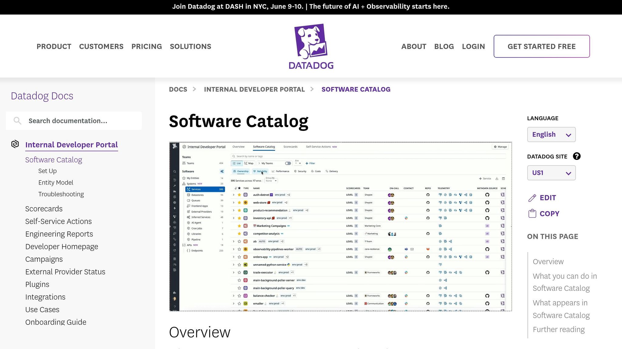
The Software Catalog (formerly known as the Service Catalog) acts as a centralized hub for service metadata, ownership, and relationships. By adding team and application metadata, you can adjust the Service Map to display organizational boundaries in addition to technical connections.
Grouping the Service Map by "Team" is particularly useful for identifying orphan services - those without clear ownership. This can be critical during incidents when unclear responsibilities slow down resolution. As Aaron Kaplan puts it:
Lacking a clear picture of the ownership and interplay of your services can impede accountability and cause application development, incident investigations, and onboarding processes to become prolonged and haphazard.
How to Optimize Workflow Dependencies
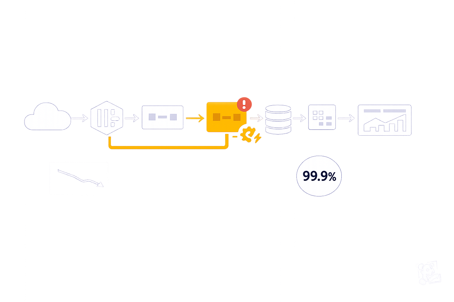
Once you've mapped out your workflow dependencies, the next step is to fine-tune them for better performance and reduced delays. Tools like Datadog offer powerful features, such as metrics analysis and workflow automation, to help you identify bottlenecks and address them efficiently - sometimes even without manual intervention. Start by analyzing metrics to uncover weak spots, then use automation to simplify and speed up processes.
Finding Bottlenecks Through Metrics Analysis
Using the insights from Datadog’s Service and Request Flow Maps, you can dig deeper into performance issues by examining detailed metrics. When you hover over service nodes, you'll see key data points like p95 latency, error rates, and throughput, which highlight slow or overloaded dependencies. For instance, if a volume bar is nearly full, it’s an indicator that a service might be overwhelmed.
To narrow down the scope of an issue, you can filter dependencies by tags such as geographic region, browser version, or environment. This helps you determine whether the problem is isolated or affecting multiple areas. If errors seem to ripple through your system, tracing the red lines in the flow map - either upstream or downstream - can lead you to the root cause. Once a bottleneck is identified, you can jump straight to service dashboards, runtime metrics, or flame graphs in the Trace Explorer for a more in-depth analysis.
After identifying problem areas, automation becomes a key tool for minimizing the need for manual troubleshooting.
Reducing Manual Work with Workflow Automation
Workflow Automation in Datadog allows you to set up rule-based actions that execute automatically. With over 550 pre-built actions and 40+ blueprints, you can automate tasks like restarting services, scaling up resources, or blocking malicious IP addresses. These workflows can be triggered in several ways: by monitor alerts, on a set schedule, or through on-demand requests.
For example, if a latency monitor detects a threshold breach, an automated workflow can immediately scale your cluster or clear a cache to resolve the issue. For tasks that require human intervention, you can include manual approval steps to maintain oversight while still automating the bulk of the process. This centralized system cuts down on context switching, speeds up problem resolution, and enhances overall workflow performance within Datadog.
Monitoring Changes That Impact Dependencies
Even the best workflows can falter when changes occur. With 70% of outages caused by faulty deployments, keeping a close eye on updates is essential.
Datadog's Change Tracking tool gives you a centralized view of stack changes - like deployments, feature flag adjustments, Kubernetes events, and database updates - right within monitors, dashboards, and service pages. This makes it easier to connect performance issues with recent changes. For instance, if a monitor triggers an alert, the status page highlights recent updates tied to the affected service, helping you quickly pinpoint whether a deployment or feature flag caused the problem. Let’s break down how to track deployments, manage feature flags, and set up alerts to protect your workflow dependencies.
Monitoring Deployments and Feature Flags
To keep tabs on deployments, use unified tagging with the reserved version tag across your infrastructure, traces, and logs. This allows Datadog to automatically group performance data by code version and maintain a 30-day history of deployments. On APM Service Pages, you’ll find a timeline showing changes for each service and its dependencies, alongside key health metrics like latency and error rates. This setup makes it easier to identify if a downstream update is impacting performance.
For feature flags, the LaunchDarkly integration brings toggle events into context. If a flag is causing issues, you can disable it directly from the Change Tracking side panel using Workflow Automation. Additionally, Change Overlays on dashboard timeseries widgets let you visually match metric spikes with deployments. Just toggle the "Show Overlays" button to align deployment timestamps with your graphs. To cut through the noise, apply the "Show only faulty changes" filter, which highlights problematic updates flagged by Watchdog AI. Next, let’s look at how to configure alerts that notify your team about critical changes to dependencies.
Setting Up Alerts for Dependency Changes
Setting up effective alerts begins with consistent tagging. When creating monitors, establish parent/child relationships to consolidate alerts if a core dependency fails.
Datadog’s Change Alert Monitor is specifically designed to notify teams about major changes in your environment. When an alert is triggered, the Change Tracking side panel provides detailed context - like version differences, rollout statuses, commit links, and Kubernetes cluster metadata - to help with root cause analysis. For containerized dependencies, track Kubernetes deployment changes to monitor pod restarts and resource saturation alongside service alerts. This detailed visibility shifts your team’s response from reactive troubleshooting to quick resolution. By integrating proactive alerting into your workflow, you can ensure smoother operations and minimize disruptions.
Tracking Results and Improving Over Time
Once you've optimized dependencies, the next step is to measure and maintain those improvements. Without clear metrics, it's tough to gauge the real impact of your efforts. By tracking results after identifying and optimizing dependencies, you can ensure performance gains are not just temporary but lasting.
Start by monitoring core dependency metrics such as average latency, error rates, and throughput (requests per second) for both upstream and downstream services. Keep an eye on load amplification using real-time edge weights. Tools like the Dependency Map Navigator can help by displaying real-time traffic volume and highlighting areas of load amplification. To get a broader view of workflow health, track DORA metrics like Deployment Frequency, Lead Time for Changes, Change Failure Rate, and Time to Restore Service. While automated workflows can respond to issues quickly, consistent monitoring ensures long-term stability.
Setting Up Key Performance Indicators
Defining the right KPIs turns abstract progress into tangible results. Focus on performance, efficiency, and reliability to cover all aspects of service health. For example, track p50 latency to understand overall trends, and p95 latency to catch tail-end issues that could lead to timeouts. Requests per second provide insight into load distribution, while error rates can reveal potential cascading failures in downstream services.
Set SLOs (Service Level Objectives) for critical dependencies using monitor- or metric-based configurations to trigger alerts before performance dips. Within the Internal Developer Portal, use scorecards to create custom rules that automatically evaluate dependency health and production readiness. Regularly compare p50 latency week over week to identify gradual performance declines that might otherwise go unnoticed. For deeper optimization, use tools like Datadog to continuously analyze and refine your metrics.
Using Datadog Insights for Ongoing Optimization
Sustained improvement relies on automation and intelligent analysis. Watchdog Insights in Datadog can automatically detect anomalies, problematic deployments, and performance trends in your APM data without requiring manual setup. The "Watchdog Explains" feature helps you understand unusual metric behaviors, making it easier to fine-tune your dependency management strategies. Additionally, Graph Insights can uncover correlations between metrics, showing how changes in telemetry impact service dependencies.
The Dependency Map Navigator is another powerful tool for reducing MTTR (Mean Time to Recovery). It allows you to quickly pinpoint large upstream callers. By clicking on "Service Details", you can correlate runtime metrics with issues and even export Request Flow Map snapshots for postmortem analysis. Pay attention to the thickness of connection lines in the Request Flow Map - thicker lines indicate higher request volumes and can reveal shifts in traffic patterns over time.
Conclusion
Effectively managing workflow dependencies is crucial for maintaining strong performance and keeping costs under control as your system grows. As Datadog points out, "Visibility into upstream and downstream dependencies is key to maintaining a performant microservices environment". Without a clear understanding of how services interact, potential issues can go unnoticed, leading to performance bottlenecks and unnecessary expenses.
This guide explored how Datadog's tools - like the Service Map, Software Catalog, metrics analysis, and automation - help you quickly identify and address problems. These features enable smarter resource use and reduce the time spent troubleshooting.
For small and medium-sized businesses (SMBs), the stakes are even higher. Datadog highlights that "Load amplification drags down application performance and drives up costs". With tighter budgets, inefficiencies can have a bigger impact. Tools like the Dependency Map Navigator allow you to identify problems, such as the n+1 query issue, before they escalate and affect your bottom line.
Datadog also offers a 14-day free trial, giving you a no-risk chance to explore its APM and dependency mapping features. Start by mapping your most critical services, setting up dependency monitors to reduce alert fatigue, and configuring SLOs for key components. Even a small reduction in mean time to resolution (MTTR) can translate into significant cost savings and better customer experiences. By using Datadog’s capabilities, you can keep your infrastructure efficient, adaptable, and prepared for future challenges.
FAQs
What’s the fastest way to find the critical dependency causing an outage?
The Dependency Map Navigator is your go-to tool for pinpointing critical dependencies during an outage. It provides a clear visualization of service dependencies and flags any performance issues that might be causing trouble.
For deeper analysis, the Trace Explorer is incredibly helpful. It allows you to search through traces and zero in on problematic spans, giving you a closer look at the root cause of the issue.
By using these tools together, you can quickly identify and diagnose the dependency that's affecting your system.
How do I spot load amplification (n+1) in my service calls?
To spot load amplification issues in Datadog, start by examining the Dependency Map. This tool helps you identify downstream services experiencing unusually high loads. If a service is handling more requests than expected, it could be a sign of load amplification.
Next, use the Request Flow Map to get a real-time visualization of service call patterns. This map makes it easier to detect excessive or repetitive calls between services, which are often at the root of n+1 problems.
Finally, keep an eye on request latency and throughput metrics. Sudden spikes in these metrics can indicate that a single request is triggering multiple downstream calls. These insights can help you pinpoint where the amplification is occurring and take steps to address it.
Which dependency KPIs and SLOs should I set first for SMB apps?
Prioritize availability and latency metrics when working on SMB applications, as these directly influence reliability and user satisfaction. For Availability, set an SLI (Service Level Indicator) to track successful server responses - like aiming for 99.9% uptime. For Latency, define an SLI to monitor response times, ensuring they align with user expectations, such as keeping the 95th percentile under 200ms. These metrics are key to delivering reliable, fast services while efficiently managing monitoring efforts and resources.