Real-Time Metrics Dashboards: Setup Guide
Learn how to set up real-time metrics dashboards to monitor system performance, optimize resources, and improve decision-making for your business.
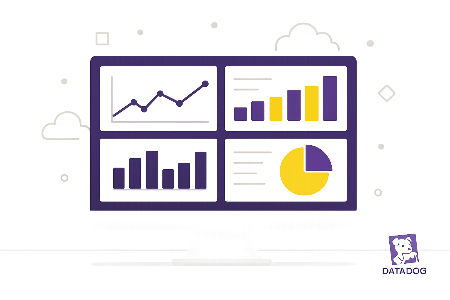
Real-time metrics dashboards help you monitor system performance live, turning data into actionable insights. They track key metrics like CPU usage, memory, and network traffic, ensuring you can spot and fix issues quickly. Here's what you need to know:
- What They Do: Provide live updates on system health to prevent problems.
- Why They Matter for SMBs: Detect issues early, optimize resources, and improve performance.
- How to Set Up:
- Connect data sources (e.g., host agents, cloud services, applications).
- Choose a dashboard type: Timeboard (time-series data) or Screenboard (custom layout).
- Add widgets for metrics like CPU, memory, and business KPIs.
- Organize widgets by priority and set refresh rates (e.g., 1 minute for business metrics).
Quick Comparison of Dashboard Types
| Dashboard Type | Use Case | Features |
|---|---|---|
| Timeboard | Performance monitoring | Fixed time-series graphs, uniform timeframes |
| Screenboard | Status overview | Custom widget sizes, free-form layout |
Regular maintenance, role-based access, and scalable designs keep dashboards effective. Focus on critical metrics, organize data logically, and use advanced visualizations like composite metrics for deeper insights. Stay proactive with weekly reviews and updates to ensure dashboards evolve with your needs.
Datadog Dashboards Explained | Datadog Overview ...
Setup Requirements
Set up your environment to ensure smooth data collection and proper functionality.
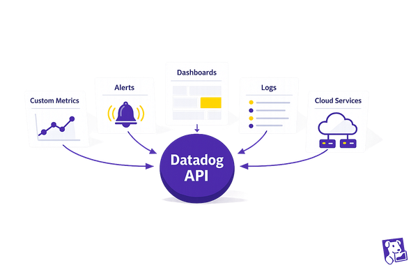
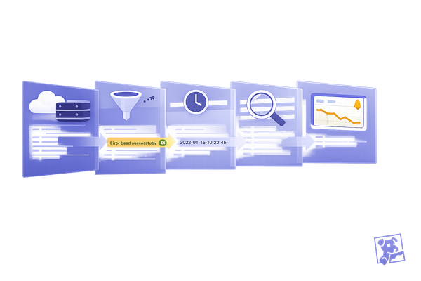
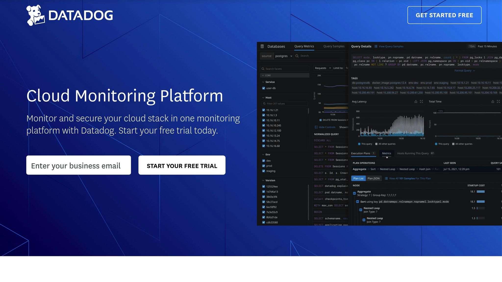
Connecting Data Sources
Link your dashboard to the right data sources. Datadog supports various input types:
| Data Source Type | Purpose | Key Metrics |
|---|---|---|
| Host Agents | Tracks system performance | CPU, memory, disk usage |
| Cloud Services | Monitors cloud resources | Instance health, costs |
| Applications | Analyzes app performance | Response times, error rates |
After connecting, check that data is flowing correctly from each source. Use the metrics explorer to confirm active data transmission.
Creating Your First Dashboard
Once your data sources are active, it's time to build your dashboard.
Dashboard Setup
Go to the Dashboards section and click "New Dashboard." Decide between two options: "Timeboard" for time-series data or "Screenboard" for a more flexible layout. Choose a descriptive name for your dashboard to make it easily identifiable.
| Dashboard Type | Best Use Case | Key Features |
|---|---|---|
| Timeboard | Performance monitoring | Fixed time-series graphs, uniform timeframes |
| Screenboard | Status overview | Custom widget sizes, free-form layout |
After selecting your dashboard type, start adding widgets to display the metrics you want to monitor.
Widget Setup
- Click "Add Widget."
- Pick a visualization type and link it to the appropriate metric query.
- Set up alert thresholds and apply conditional formatting to highlight critical data.
Some essential widgets to consider:
- System health indicators (e.g., CPU and memory usage)
- Application response times
- Error rate monitors
- Business KPI trackers
Layout and Update Settings
Arrange widgets based on priority. Place alerts and critical metrics at the top for quick access.
Adjust update frequencies to match your monitoring requirements:
| Metric Type | Refresh Rate | Data Retention |
|---|---|---|
| Critical Systems | 15 seconds | 24 hours |
| Business Metrics | 1 minute | 7 days |
| Long-term Trends | 5 minutes | 30 days |
Set your dashboard's auto-refresh interval to align with the most frequently updated widgets. For most small to medium-sized businesses, a 1-minute refresh rate strikes a good balance between real-time updates and system performance.
Metrics Configuration
Choosing SMB Metrics
When selecting metrics, focus on those that directly affect your business operations. Here are three key categories to consider:
| Metric Category | Key Indicators |
|---|---|
| Infrastructure Health | CPU Usage, Memory Utilization, Disk Space |
| Application Performance | Response Time, Error Rates, Request Count |
| Business Impact | Transaction Volume, Revenue per Hour, Active Users |
Organizing Your Data
To make your metrics easier to manage and analyze, use tags and filters for logical grouping. A consistent naming convention is crucial. Here's a breakdown:
| Tag Type | Example Format | Purpose |
|---|---|---|
| Environment | env:production | Distinguish between staging and production environments |
| Service | service:payment-api | Monitor metrics for a specific service |
| Region | region:us-east | Analyze performance by geographic location |
You can also create hierarchies based on your business priorities. By grouping related services, you’ll be able to spot dependencies and troubleshoot problems more effectively. With a well-structured setup, you’re ready to explore advanced visualization techniques.
Advanced Visualization Techniques
Take your metric analysis to the next level with advanced visual tools:
-
Composite Metrics
Combine multiple metrics to track performance ratios. For example:successful_transactions / total_transactions * 100 -
Dynamic Expressions
Create adaptable expressions that reflect changing business patterns. For instance:avg:system.cpu.user{*} by {host} * avg:system.memory.used{*} by {host} -
Visual Correlations
Overlay charts to uncover relationships between different metrics. For example, comparing customer login rates with server response times can help pinpoint performance issues during high-traffic periods.
These tools will give you a clearer picture of your system’s performance and help you address potential issues proactively.
Dashboard Management
Once you've set up your metrics and visualizations, the next step is managing access and keeping your dashboards running smoothly.
Team Access Setup
Define roles with specific access levels to ensure efficient collaboration. Here's a breakdown of common roles:
| Role Level | Access Rights | Example Users |
|---|---|---|
| Admin | Full control over dashboard creation and editing | DevOps leads, IT managers |
| Editor | Can modify widgets and adjust layouts | Team leaders, analysts |
| Viewer | Limited to view-only access with filtering options | Stakeholders, team members |
Tailor dashboards for different teams. For instance, developers may need detailed performance stats, while business analysts focus on high-level KPIs.
Maintenance Schedule
Regular maintenance keeps dashboards reliable and up-to-date. Follow this schedule:
1. Weekly Review
Start each week by checking for broken widgets, ensuring data is accurate, and addressing any performance issues.
2. Monthly Optimization
On the first Tuesday of each month, clean up unused widgets, update data connections, fine-tune queries, and confirm permissions are correct.
3. Quarterly Audit
Every quarter, archive outdated dashboards, refresh KPIs, scale appropriately, and update any related documentation.
Growth Planning
As your organization grows, your dashboards need to evolve. Address these areas to scale effectively:
| Growth Area | Action Steps | Tips for Implementation |
|---|---|---|
| Data Volume | Use data aggregation techniques | Roll up summaries for historical trends |
| User Base | Expand access controls | Develop team-specific templates |
| Complexity | Organize widgets hierarchically | Create parent-child dashboard structures |
Pro Tips:
- Use filtered queries to keep data relevant.
- Set refresh intervals based on how critical the data is.
- Design dashboards to be modular and easy to replicate.
- Keep a record of all customizations for future reference.
Summary
Implementing a real-time dashboard involves a step-by-step process that includes setup, creation, and ongoing improvements. This process is divided into four main phases:
| Phase | Key Activities | Tips for Success |
|---|---|---|
| Initial Setup | Configuring accounts, Integrating data sources | Ensure proper access permissions and verify data streams. |
| Dashboard Creation | Selecting widgets, Organizing layout | Focus on intuitive design and set regular refresh rates. |
| Metrics Management | Choosing KPIs, Structuring data | Use relevant metrics and streamline data queries. |
| Maintenance | Managing access, Scheduling updates | Provide team-specific views and maintain clear documentation. |
To keep dashboards running smoothly, regular upkeep and a design that can scale with your needs are essential. Here are some best practices to follow:
- Adjust refresh rates based on how critical the data is.
- Organize widgets in a clear, hierarchical structure.
- Define ownership roles and maintain thorough documentation.
Additionally, three key areas demand attention for long-term success:
- Data Volume: Streamline query processing to handle increasing data efficiently.
- Team Access: Use role-based permissions to manage access securely.
- Dashboard Scaling: Conduct regular audits to ensure scalability and relevance.
Striking the right balance between real-time monitoring and system performance is crucial. A well-designed dashboard limits the number of widgets per view to maintain functionality without sacrificing visibility. With regular reviews, dashboards can adapt to changing business needs, turning data into actionable insights that guide smart decision-making.
Additional Resources
Fine-tune your dashboard setup by diving into resources tailored for small and medium-sized businesses (SMBs). These materials provide expert advice and regular updates to help you get the most out of your Datadog configurations.
Key Content Areas
Datadog offers two main sections packed with valuable insights:
| Section | Focus | How It Helps Your Dashboard |
|---|---|---|
| Featured Articles | Technical deep dives | Step-by-step dashboard setup guidance |
| Latest Updates | Optimization strategies | Insights on new features and design approaches |
These resources are designed to complement the strategies discussed earlier, helping you keep your monitoring setup effective and aligned with SMB requirements. Topics covered include:
- Performance Tips: Ensure your dashboard runs smoothly and efficiently.
- Scaling Approaches: Learn how to grow your monitoring capabilities as your needs evolve.
- Advanced Configurations: Get technical advice for more complex setups.
For SMBs, this content bridges the gap between basic setups and advanced configurations, offering practical, implementation-focused guidance.
Check out datadog.criticalcloud.ai to stay on top of the latest optimization strategies.
FAQs
What’s the difference between a Timeboard and a Screenboard, and how do I choose the right one for my real-time metrics dashboard?
When deciding between a Timeboard and a Screenboard for your real-time metrics dashboard in Datadog, it comes down to your specific needs and use case.
- Timeboards are ideal for tracking metrics over time. They’re dynamic and automatically update with real-time data, making them perfect for monitoring trends, troubleshooting issues, and analyzing historical performance.
- Screenboards, on the other hand, are more flexible and customizable. They’re great for creating visual summaries, combining different types of data, and building dashboards tailored for presentations or team overviews.
If your focus is on live monitoring and historical analysis, go with a Timeboard. For a more static, highly customized layout, opt for a Screenboard. Both options allow you to effectively visualize and manage your system’s performance in Datadog.
What are the best practices for keeping my real-time metrics dashboard optimized and effective over time?
To ensure your real-time metrics dashboard remains effective, regularly review and update it based on your team's evolving needs. Start by removing outdated or irrelevant widgets to keep the dashboard focused and uncluttered. Periodically check that your metrics, alerts, and visualizations align with your current business goals and system performance priorities.
Additionally, use tags and filters strategically to make your data easier to navigate and understand. Group similar metrics together for better readability and ensure all team members are familiar with the dashboard's layout. Finally, monitor user feedback and system changes, making adjustments as needed to maintain accuracy and relevance.
How can I use advanced visualization techniques to get more meaningful insights from my real-time metrics dashboard?
To gain deeper insights from your real-time metrics dashboard, you can leverage advanced visualization techniques in Datadog. Start by customizing your dashboard widgets to highlight key metrics using graphs, heatmaps, and distribution charts. This helps you identify patterns, anomalies, and trends more effectively.
Additionally, use multi-layered visualizations to combine related data points into a single view. For example, overlaying system performance metrics with user activity data can provide a clearer picture of how infrastructure changes impact customer experience. By fine-tuning your visualizations, you can make your dashboards not only more informative but also actionable for your team.