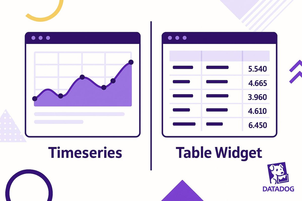
Timeseries vs. Table Widgets: Choosing the Right One
Learn how to choose between timeseries and table widgets for effective data visualization, monitoring trends, and analyzing detailed metrics.
Need to decide between timeseries and table widgets for your dashboard? Here’s the short answer:
- Use timeseries widgets to track trends and changes over time. Perfect for spotting patterns, monitoring anomalies, and analyzing historical data like CPU usage or response times.
- Use table widgets for detailed comparisons and current-state analysis. Ideal for troubleshooting, resource audits, and pinpointing specific components causing issues.
Quick Comparison Table
| Aspect | Timeseries Widgets | Table Widgets |
|---|---|---|
| Purpose | Track trends and changes over time | Organize and analyze detailed data |
| Best For | Continuous metrics (e.g., CPU usage) | Discrete values and logs |
| Focus | Historical trends | Current state |
| Strengths | Spotting patterns, anomaly detection | Precise comparisons, troubleshooting |
| Weaknesses | Can be cluttered with too much data | Not suitable for time-based analysis |
Pro Tip: Combine both widgets for a comprehensive dashboard. Use timeseries for big-picture insights and tables for detailed drill-downs. Keep your dashboard clean by grouping related metrics and using consistent color coding.
I06 Build Datadog Dashboards That Actually Help During Outages (Complete Guide)
Timeseries Widgets: Tracking Metric Changes Over Time
Timeseries widgets are a powerful way to visualize how system performance changes over time. They make it easy to spot trends, uncover anomalies, and understand the behavior of your infrastructure.
Main Features and How They Work
Timeseries widgets take raw data and transform it into clear, visual charts. With time on the X-axis and measurement values on the Y-axis, these widgets can display up to five metrics in a single chart, using lines or bars to represent each one. For more intricate monitoring needs, they can handle up to 10 different series, allowing you to monitor multiple aspects of your infrastructure all at once.
You can also filter metrics by host, service, or custom tags through aggregation, which helps you zoom in on specific issues while still keeping an eye on overarching trends. This combination of detail and context makes it easier to identify patterns that might otherwise be buried in raw data.
The visual format of timeseries widgets is particularly effective at revealing cause-and-effect relationships, making it simpler to connect the dots between events and their impact.
When to Use Timeseries Widgets
Timeseries widgets are especially useful for tracking infrastructure trends like CPU usage, memory consumption, network activity, and storage metrics. They’re ideal for capacity planning and optimizing performance by revealing long-term patterns and insights.
One standout use case is peak hour analysis. By visualizing response times, throughput, and resource use during different periods, you can pinpoint when your systems are under the most strain and plan accordingly. This view helps you separate routine fluctuations from real performance concerns.
Another key benefit is anomaly detection. Sudden spikes, gradual performance dips, or unusual trends become immediately visible when compared to historical baselines, making it easier to address issues before they escalate.
Change tracking is another critical application. By monitoring metrics like error counts after a deployment or configuration update, you can quickly determine if recent changes have caused new problems.
For small and medium-sized businesses, seasonal pattern recognition can be a game-changer. Timeseries widgets can reveal recurring trends, such as increased traffic during holidays or higher system loads at the end of the month, giving businesses the foresight to prepare for predictable events.
Timeseries Widget Benefits and Drawbacks
Timeseries widgets bring a lot to the table, especially for teams focused on monitoring and analyzing trends. They’re excellent at visualizing trends, spotting anomalies, and comparing multiple data series, making them a key tool for infrastructure management.
Their user-friendly format means even team members without technical expertise can quickly interpret the data. Chronological presentation helps uncover recurring issues and provides a foundation for predicting future challenges. The historical context they offer is invaluable for distinguishing between temporary glitches and deeper, systemic problems.
However, they’re not without limitations. Timeseries widgets can struggle when dealing with large datasets, where maintaining clarity and performance might require aggregating data into broader time intervals.
| Benefits | Drawbacks |
|---|---|
| Clear trend visualization and pattern identification | Can become cluttered with too many metrics |
| Easy to understand, even for non-experts | Less effective for analyzing current states |
| Historical data for better decision-making | Performance issues with large datasets |
| Great for anomaly detection | Requires data aggregation for extended periods |
| Flexible chart types (line, area, column) for different needs | May overlook details better suited for tables |
Choosing the right chart type is crucial. Line charts are perfect for tracking continuous trends, column charts work well for summed values or discrete data points, and area charts are ideal for showing continuous quantities like bandwidth or storage usage.
That said, timeseries widgets aren’t ideal for comparing specific values across multiple hosts or services at a single moment. For such cases, switching to table widgets can provide the level of detail needed for precise analysis.
Table Widgets: Organizing Data for Detailed Analysis
Table widgets take a structured approach to data visualization. Instead of focusing on how metrics evolve over time, they arrange information into rows and columns, offering a clear and organized way to pinpoint critical details quickly.
Main Features and How They Work
Table widgets present grouped metrics in a grid format, resembling a spreadsheet. This layout makes it easy to scan through your monitoring data.
- Sorting: You can click on any column header to rearrange data based on your priorities. For example, you might sort by highest CPU usage, lowest response times, or the latest error counts.
- Conditional formatting: Critical values that exceed set thresholds are automatically highlighted, helping you zero in on potential issues immediately.
When to Use Table Widgets
Table widgets shine in scenarios where comparing performance across environments is key. For instance, if you’re evaluating how an application runs in development, staging, and production, the tabular format simplifies these comparisons and focuses on the current state.
They’re also great for resource usage analysis. Whether you need to identify servers consuming the most memory, databases with higher query times, or services generating more errors, table widgets give you a detailed breakdown to guide your monitoring efforts.
When it comes to troubleshooting incidents, table widgets are indispensable. While timeseries widgets help track trends over time, table widgets allow you to pinpoint which specific components are affected. You can dive into error logs, response times, or resource metrics to uncover the root cause of a problem.
For smaller organizations, table widgets are especially helpful for service health monitoring. They provide a complete view of critical services, summarizing statuses, response times, and error rates in a single, organized display.
Table Widget Benefits and Drawbacks
Table widgets are perfect for tasks requiring detailed comparisons and precise data analysis. They’re ideal for showing raw metrics or logs, making it easy to compare items and spot outliers that might not be obvious in aggregated views.
Their precise presentation ensures you see exact numbers, which is crucial for troubleshooting and detailed analysis. Unlike charts that might smooth or aggregate data, tables present the raw values, giving you a clear picture of what’s happening.
The sorting feature simplifies managing large datasets, allowing you to focus on the most critical issues or locate specific data points quickly.
However, table widgets aren’t without limitations. They lack time-based visualization, which makes them less effective for understanding trends or changes over time. Additionally, when dealing with very large datasets, they can feel cluttered and lead to information overload.
| Benefits | Drawbacks |
|---|---|
| Precise comparisons across multiple items | Limited for time-based trend analysis |
| Sorting simplifies large datasets | Can feel overwhelming with excessive data |
| Clear view of exact values | Not as intuitive for spotting patterns over time |
| Great for troubleshooting specific issues | Requires more effort to interpret |
| Highlights critical data with conditional formatting | Not ideal for showing metric relationships |
Table widgets are most useful when current-state analysis takes priority over tracking trends. They complement timeseries widgets by offering a detailed, point-in-time perspective, helping you make informed decisions based on the present situation.
How to Choose Between Timeseries and Table Widgets
Choosing the right widget boils down to understanding your data goals. Are you looking to track changes over time or to examine detailed, current-state information? The answer will guide your decision.
Comparing Timeseries and Table Widgets
Each widget type serves a distinct purpose. Here’s a quick breakdown to help you align them with your monitoring needs:
| Aspect | Timeseries Widgets | Table Widgets |
|---|---|---|
| Primary Purpose | Track changes and trends over time | Organize and analyze detailed data |
| Best Data Types | Continuous metrics (e.g., CPU usage) | Discrete values and log data |
| Visualization Goal | Highlight trends and patterns | Present organized, detailed snapshots |
| Time Focus | Historical trends | Current state |
Both widgets are essential tools, but their utility depends on your specific operational focus.
When to Use Each Widget Type
The choice between timeseries and table widgets depends on your use case. Here’s how to decide:
Timeseries Widgets Are Best For:
-
Capacity Planning
Timeseries widgets are invaluable for forecasting and planning. They show historical data that helps identify patterns like seasonal fluctuations, growth trends, and resource usage spikes. This insight is crucial for predicting storage needs or planning server upgrades. -
Performance Monitoring
Use timeseries widgets to spot trends in metrics like response times, database performance, or network latency. While a single spike might not be alarming, a steady increase can indicate deeper issues that need attention. -
Incident Response
During incidents, timeseries widgets help you trace when metrics started behaving abnormally. They allow you to correlate events across systems, making it easier to pinpoint the root cause of the problem.
Table Widgets Are Best For:
-
Resource Auditing
Tables are perfect for audits, offering a clear, comparative view of resources. For example, you can quickly identify which servers consume the most memory, which apps generate the most errors, or which databases are underperforming. -
Compliance Reporting
When you need precise, current data for compliance reports, table widgets shine. They make it easy to extract exact values and present them in an organized format. -
Troubleshooting Active Incidents
While timeseries widgets show trends, table widgets allow you to zero in on specific components. For example, if a system is down, tables can identify the exact servers, applications, or hosts causing the issue.
Combining Both Widgets
Sometimes, the best approach is to use both widget types together:
-
Comprehensive Dashboards
A mix of timeseries and table widgets creates a balanced view. Timeseries widgets provide an overview of system health and trends, while tables highlight specific issues that require immediate action. -
Performance Analysis
For in-depth performance analysis, start with timeseries widgets to identify when a problem began. Then, use tables to drill down into individual components and isolate the root cause.
Matching Widgets to Your Goals
The widget you choose should align with your immediate question. If you’re asking, “What’s happening right now?” or “Which component is failing?”, go with table widgets. On the other hand, if you’re trying to answer, “How did we get here?” or “What’s the trend?”, timeseries widgets are your best bet.
Using Timeseries and Table Widgets Together
Datadog dashboards shine when you combine timeseries and table widgets. Instead of choosing between the two, small and medium-sized businesses (SMBs) often use both to build well-rounded monitoring solutions that support proactive issue resolution.
By pairing these widgets, you get a powerful combination: timeseries widgets help you track system behavior over time, while table widgets let you zero in on specific components that might need attention. Together, they transform your dashboard into a dynamic operational command center.
Dashboard Strategies Using Both Widget Types
Designing effective dashboards takes careful planning. A good approach is to organize widgets so that they flow logically, guiding users from a high-level overview to detailed insights.
The Four-Group Dashboard Structure
A well-structured dashboard can greatly enhance usability. Here's a simple four-group setup:
- About: Start with a section that provides context. Include descriptions, documentation links, or any other helpful resources.
- Overview: Use this group for a big-picture health check. Include service checks and monitor summaries to give users a quick status update.
- Core Metrics: Focus this section on key performance indicators and system health metrics.
- Logs: Dedicate this group to error tracking, featuring status timeseries and critical log streams.
This structure mirrors the natural flow of troubleshooting: starting broad, pinpointing issues, and drilling into specifics.
Strategic Widget Placement
To maximize clarity, position timeseries widgets at the top of each section to establish context. Then, place related table widgets directly below. For instance, if you're tracking CPU usage, start with a timeseries widget displaying CPU trends over the past 24 hours. Below it, add a table widget listing the current CPU usage for individual servers.
Grouping related metrics is also essential. For example, place network performance metrics next to server performance data. This alignment helps teams quickly identify correlations, like whether a network issue is affecting server performance. Such thoughtful placement speeds up incident response.
Color Coding and Visual Consistency
Consistent color schemes across widgets make data easier to interpret. If red signifies critical CPU usage in your timeseries widget, use the same color in your table widget. This uniformity reduces confusion and helps your team process information faster, especially during high-pressure situations.
These layout strategies lay the groundwork for the advanced widget integration techniques discussed below.
Advanced Methods for Connecting Widgets
Take your dashboards to the next level by linking widgets in ways that enhance their functionality.
Time Range Synchronization
Synchronize the time ranges across widgets so that adjusting the time period on one updates all related widgets. This feature is particularly useful for incident investigations. For example, if you focus on a specific time window in a timeseries widget, the corresponding table widget will instantly display data from the same period.
Event-Driven Widget Combinations
Leverage events as a shared data source for both widget types. For instance, use a timeseries widget to track the frequency of errors tagged with Error status over time. Pair it with a table widget that displays detailed information about each error. This setup lets you see both the overall trend and the granular details of those errors.
Filtering and Cross-Reference Strategies
Enable filtering between widgets for deeper insights. If a timeseries widget shows a spike in CPU usage at 2:00 PM, use it to filter the table widget to display only the servers that experienced high CPU usage during that time. This cross-referencing capability makes it easier to pinpoint the root cause of anomalies.
Top List Integration
Combine trend data from timeseries widgets with top list widgets for ranking metrics. For example, display overall system throughput in a timeseries widget and pair it with a top list widget showing the highest-performing services or most active users. This approach provides both a system-wide view and insights into individual contributors.
The secret to successful widget integration lies in understanding your team's workflow. Design your dashboards to answer the natural sequence of questions during monitoring: "What’s going on?" leads to "Where is it happening?" and finally, "What components are involved?" With this strategy, your dashboards will become indispensable tools for your team.
Conclusion: Matching Widget Choice to Business Needs
Choosing the right widget boils down to aligning your monitoring goals with the most effective tool for the job. The choice between timeseries and table widgets can shape how well your team handles incidents and keeps systems running smoothly.
Key Takeaways
Timeseries widgets are ideal for spotting trends and patterns. If you need to track how metrics change over time, identify anomalies, or analyze system performance during certain periods, timeseries widgets are your best bet. For example, they can reveal if CPU usage is steadily climbing or if response times spike during peak hours.
Table widgets are perfect for detailed comparisons and analysis. When you need to dive into specific values or compare granular data, tables provide a structured, easy-to-read format that timeseries graphs can't offer. They're particularly useful for pinpointing which servers, services, or users might be causing performance issues.
The best dashboards often combine both widget types. Pairing a timeseries chart with a table or top list widget can provide context that a single widget might lack or make difficult to interpret.
Small and medium-sized businesses (SMBs) must consider resource constraints. Unlike larger enterprises that may have the luxury of creating multiple dashboards for different needs, SMBs often need to make the most out of fewer dashboards. This makes a thoughtful mix of widget types even more important.
Use these insights as a guide when designing your dashboards.
Practical Checklist for SMBs
To simplify the process of building dashboards, consider the following questions:
- Do you need trends or comparisons? If you're analyzing changes over time, go with a timeseries widget. For comparing current metrics across multiple components, a table widget is the better choice.
- Who will use the dashboard? Executives often prefer timeseries widgets for their clear visual summaries, while technical teams may rely on table widgets for troubleshooting and detailed analysis.
- How urgent is the information? Timeseries widgets are great for real-time monitoring and identifying when issues began, while table widgets are better suited for digging into root causes during a detailed investigation.
- What’s your available space? Timeseries widgets usually need more vertical room to be effective, while table widgets can fit more data into smaller spaces. Keep your dashboard layout and screen size in mind.
Focus on showing only the metrics that matter most to avoid clutter. Group related metrics together for easier comparisons, and review dashboards regularly to ensure the data remains relevant.
The golden rule for SMB dashboards is this: start with the business question you’re trying to answer, then choose the widget that best meets that need. Whether you opt for timeseries, tables, or a mix of both, your decision should always support your team’s workflow and decision-making process.
FAQs
How can I use timeseries and table widgets together to create a better Datadog dashboard?
To build a more effective Datadog dashboard, combine timeseries widgets with table widgets in a thoughtful way. Timeseries widgets excel at showing trends over time, like monitoring CPU usage or request rates. They make it easier to identify patterns, spot anomalies, and track performance changes at a glance.
Table widgets, on the other hand, are ideal for making detailed comparisons across different dimensions, such as instances or services. Use them to keep an eye on specific metrics like error rates or response times while viewing aggregated data alongside historical trends.
When you bring these two widget types together, you can create a dashboard that balances a big-picture view with detailed, actionable insights - helping you analyze data more effectively and make smarter decisions.
How can I design a dashboard that effectively combines timeseries and table widgets?
To build a dashboard that effectively combines timeseries and table widgets, start by structuring your layout to highlight the most important metrics. Use timeseries widgets to showcase trends or patterns over time, giving a clear picture of changes and developments. Pair these with table widgets to present detailed, granular data that allows for deeper analysis.
Focus on keeping the design clean and intuitive. Stick to consistent colors, fonts, and spacing to create a cohesive look. Group related metrics logically, and consider adding filters or dropdown menus to give users the flexibility to customize their view. This thoughtful approach helps small and medium-sized businesses fully leverage Datadog's monitoring capabilities with ease and efficiency.
How can I choose between Timeseries and Table widgets when my dashboard space is limited?
Choosing Between Timeseries and Table Widgets in a Space-Constrained Dashboard
When you're working with limited space on a Datadog dashboard, selecting the right widget depends on the type of data you need to present.
Timeseries widgets are your go-to choice for visualizing metrics over time. They shine when it comes to spotting trends, tracking performance changes, or identifying fluctuations. If you need a quick and clear view of how something evolves, Timeseries is the way to go.
In contrast, Table widgets excel at comparing aggregated data across multiple dimensions. They’re perfect for side-by-side analysis of various metrics, offering a detailed breakdown that helps you contrast and analyze data effectively.
To sum it up: if you're focused on trends, stick with Timeseries. If you're comparing multiple metrics, opt for Table widgets. And to maximize your dashboard space, consider resizing widgets or zeroing in on the most critical metrics.