Datadog Dashboards: Setup Basics
Learn how to effectively set up Datadog dashboards for real-time monitoring, improving insights, and ensuring operational efficiency.
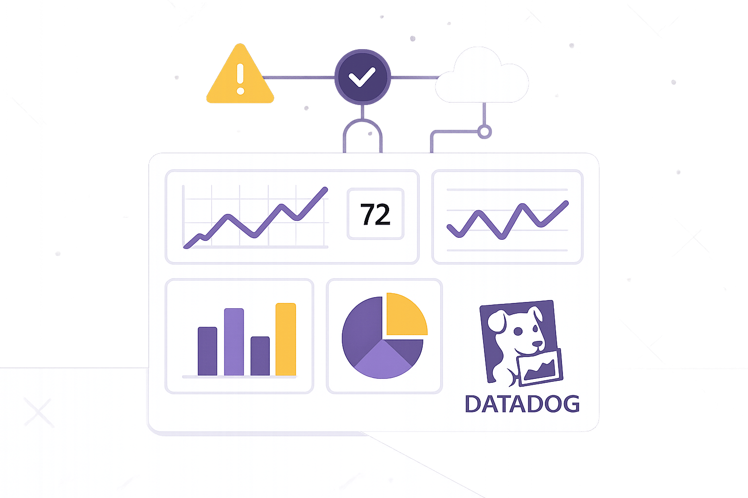
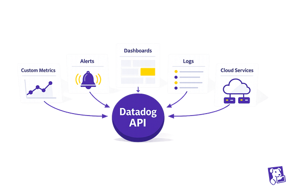
Datadog dashboards make monitoring your systems straightforward by consolidating data from servers, apps, logs, and cloud services into one interface. They’re especially useful for small and medium-sized businesses (SMBs) that need real-time insights without requiring specialized expertise. Here's how to get started:
- Set Up Permissions: Ensure you have admin access or request it. Assign roles based on the "least privilege" principle to keep data secure.
- Install the Datadog Agent: Configure core settings like API keys and enable data collection for metrics, logs, and traces.
- Build Dashboards: Choose between Timeboard (time-based monitoring) or Screenboard (flexible layouts). Add widgets like time series, query values, or heat maps to visualize key metrics.
- Organize Data: Use tags and template variables to filter information by environment, service, or team.
- Connect Data Sources: Integrate cloud platforms like AWS or Google Cloud for live monitoring and use service maps to visualize system relationships.
I06 Build Datadog Dashboards That Actually Help During Outages (Complete Guide)
Setup Requirements and Initial Configuration
Follow these steps to ensure a smooth setup and avoid headaches down the road.
Checking User Permissions and Account Access
Before diving in, make sure you have the right permissions to create and manage dashboards. Without proper access, you’ll hit roadblocks right from the start.
If you’re not an admin, contact your Datadog administrator to either grant you the necessary permissions or handle the setup themselves. Once you have admin access, you can create custom roles with specific dashboard permissions, such as view, edit, clone, or delete. This flexibility is particularly useful for smaller teams where individuals often juggle multiple responsibilities. For instance, you might allow developers full editing rights while limiting executives to read-only access for high-level metrics.
Stick to the "least privilege" principle. Start with minimal permissions - like read-only - and expand access as needed. This keeps your data secure while ensuring everyone has the access they require. Assign roles to teams for better scalability and efficiency in managing permissions.
Don’t forget to review permissions regularly. Conducting quarterly audits is a smart practice, especially for growing teams where roles and responsibilities shift frequently.
Installing and Setting Up the Datadog Agent
The Datadog Agent is the backbone of your monitoring setup, collecting metrics, logs, and traces from your systems and sending them to Datadog for visualization.
Begin by configuring the core settings - API key, Datadog site, and hostname - to link your system to Datadog.
| Component | Purpose | Example Setting |
|---|---|---|
| Core Settings | Basic agent configuration | api_key, site, hostname |
| Collection Settings | Data collection parameters | logs_enabled: true, apm_config.enabled: true |
| Security Settings | Access and authentication | proxy, skip_ssl_validation |
| Performance Settings | Resource usage controls | process_config.process_collection.enabled |
Enable the data collection settings based on your needs. For example, turn on logs collection to monitor application and system logs, and enable APM (Application Performance Monitoring) to track application traces and performance metrics.
Tags are essential for organizing and filtering your data. Use environment tags like env:production to distinguish production data from development data. Service tags such as service:payment-api can highlight specific application components, while team tags like team:platform and cost-related tags like cost:infrastructure help with ownership and budgeting.
Here’s why this matters: companies using detailed monitoring solutions report a 30% boost in incident response efficiency. Teams that leverage integrations cut downtime by 50%, and customized dashboards lead to a 40% improvement in system performance insights.
Configure log sources based on your infrastructure. For instance, application logs can be collected from file paths like /var/log/*, while TCP/UDP ports (e.g., port: 10514) are ideal for network device logs. On Linux systems, use journalctl for system service logs, and for Windows environments, configure Windows event logs.
| Log Source Type | Configuration Path | Use Case |
|---|---|---|
| Files | /var/log/* |
Application logs |
| TCP/UDP | port: 10514 |
Network device logs |
| Journald | journalctl |
System service logs |
| Windows | windows_event |
Event logs |
Fixing Agent Connection Issues
Even with everything set up, connection issues can still arise. Knowing how to troubleshoot these problems ensures your monitoring remains uninterrupted.
Start by running the agent’s status command to confirm data flow and server communication. Agent logs are your best friend here - they provide detailed insights into connection attempts, authentication errors, and data transmission issues. Look for error messages related to API keys, network settings, or permissions.
Common connectivity problems often stem from firewalls blocking outbound connections to Datadog’s servers or misconfigured proxy settings disrupting data transmission. Invalid API keys or incorrect site configurations can also cause authentication failures.
To troubleshoot:
- Check your network configuration if the agent can’t connect to Datadog’s servers. Ensure your firewall allows outbound HTTPS traffic on port 443.
- Verify proxy settings and double-check the API key for accuracy.
- Test DNS resolution using tools like
pingornslookupto confirm your system can resolve Datadog’s domain names.
Once resolved, keep an eye on the agent’s status. Setting up alerts to notify you if an agent stops reporting data is a proactive measure to catch issues early, before they impact your dashboards.
With these steps completed, you’re ready to start building your dashboards.
Building and Setting Up Dashboards
With your Datadog Agent up and running, the next step is creating dashboards to help your team track key metrics and spot trends at a glance.
How to Create a New Dashboard
Dashboards in Datadog make it easy to visualize data, spot patterns, and address potential issues. To get started, head to the Dashboards section in your Datadog account and click + New Dashboard.
You'll first need to choose a layout. The Timeboard is ideal for monitoring performance metrics over time, like CPU usage trends. On the other hand, the Screenboard offers a more flexible layout, allowing you to mix different types of content. Once you've picked the right layout, give your dashboard a clear and descriptive name - something like "E-commerce Site Performance" works well for SMB operations.
After setting up the basics, it's time to add widgets. Each widget should be tied to a specific query to display the right data. For example, you can use avg:aws.ec2.cpuutilization to track the CPU usage of your EC2 instances. You can also configure widgets to show data for a default time range or let users select custom ranges for deeper analysis.
To make your dashboard more effective, use colors strategically - like red for high latency - and group related metrics together for better clarity. A well-organized dashboard with clear labels and logical groupings makes it easier to interpret data quickly.
Dashboard Naming and Organization
Keep dashboard names simple and to the point. For example, a dashboard tracking NGINX metrics should be named "NGINX Performance" instead of something overly complex.
Organize widgets into groups to improve readability. Think of these groups as sections in a book, each focusing on a specific area - like database performance, application metrics, or infrastructure health. This structured approach makes it easier to detect issues quickly and supports proactive monitoring, helping SMBs address problems before they escalate.
Choosing Widgets and Setting Up Layout
Picking the right widgets and arranging them thoughtfully is key to turning raw data into clear, actionable insights. This step is a natural extension of the dashboard creation process, ensuring your data aligns with your monitoring goals.
Types of Widgets Available
Datadog provides a variety of widget types, each tailored to display specific data and support different monitoring needs. Using the right widget for the right purpose ensures your dashboard delivers maximum clarity.
- Time Series widgets: These track changes in metrics over time, making them ideal for monitoring trends like CPU usage, memory consumption, or response times. They’re especially useful for identifying peak traffic periods or potential bottlenecks.
- Query Value widgets: These display single numerical values, perfect for showcasing critical stats like active user counts, daily transactions, or current error rates. They offer a quick snapshot of key metrics.
- Top List widgets: These rank data by showing the highest or lowest values in a category. For example, they can highlight which servers are using the most resources or which applications are generating the most errors.
- Heat Map widgets: These use color coding to visualize data distribution, making it easier to spot patterns in large datasets. For instance, they can show geographic regions with slower response times or time periods with increased error rates.
When monitoring the four golden signals - latency, traffic, errors, and saturation - select widgets that best represent each metric. For example, latency monitoring might require breaking down request counts by latency buckets to distinguish between average and extreme delays.
Organizing Widgets for Better Results
A well-organized dashboard starts with a logical flow, moving from high-level summaries to detailed insights. Place your most critical metrics at the top, followed by supporting data below.
To avoid clutter, use group widgets to organize panels into related categories. Think of each group as a chapter in a book, focusing on a specific set of metrics. For example, you might have separate groups for application performance, infrastructure health, and business metrics.
Leverage the drag-and-drop feature to arrange widgets in a way that creates visual hierarchies. Highlight primary metrics with larger widgets and keep related widgets nearby to make correlations easier to spot.
Also, consider your team’s workflow when setting up the layout. If your developers usually start by checking error rates and then dive into specific failed requests, arrange widgets in that sequence. This logical order can save time and streamline troubleshooting.
Widget Type Comparison
Mixing widget types ensures your dashboard covers trends, current statuses, rankings, and patterns effectively.
| Widget Type | Best Use Case | Key Benefit |
|---|---|---|
| Time Series | Tracking trends and patterns over time | Provides historical context and analysis |
| Query Value | Displaying current status or totals | Offers instant visibility of key metrics |
| Top List | Ranking and comparing multiple items | Identifies critical outliers quickly |
| Heat Map | Visualizing data distribution patterns | Highlights patterns in large datasets |
These widgets provide a solid foundation for building dashboards that deliver insights with minimal effort.
Connecting Data Sources for Live Monitoring
Once your dashboards are set up and organized, the next step is to bring them to life by integrating live data. By connecting data sources, you can transform static panels into dynamic tools that provide real-time insights into your infrastructure, applications, and business metrics.
Adding Data Sources to Dashboards
Datadog offers integrations with major cloud platforms like AWS, Azure, Google Cloud, and Oracle Cloud, enabling seamless collection and visualization of metrics, logs, and traces from your cloud resources. You can activate these integrations through Datadog's integrations page, allowing you to instantly access data from services such as EC2 instances, RDS databases, or Lambda functions. The Datadog Agent, deployed in your cloud environment, collects telemetry nearly in real-time, ensuring your dashboards always display up-to-date system information.
By integrating infrastructure metrics, application performance monitoring (APM), and real user monitoring (RUM) data, you can achieve a complete view of your system - from server performance to user experience. Dashboards can combine multiple data streams, such as server CPU usage, application response times, and user session data, all in one place.
Service Maps are another powerful tool that helps you visualize the relationships between different components of your system. These maps make it easier to identify which data sources are most critical for your monitoring goals. Use them to plan your dashboard configuration and ensure you're capturing metrics from every key service in your application stack.
Setting Up Filters and Template Variables
Template variables make dashboards more flexible and adaptable, allowing you to tailor them to different environments, applications, or services. By using tags and facets from your infrastructure, you can create dynamic filters that let a single dashboard monitor production, staging, and development environments. Starting with broad tags like "env" and "aws_account" helps narrow down the data to what's most relevant.
The template variable modal allows you to select dropdown values. For instance, you might create an "environment" variable with options like "production", "staging", and "development" to eliminate unnecessary entries and streamline monitoring.
Saved views are another useful feature. They let you store frequently used combinations of template variables, so you don’t have to remember specific settings for different scenarios. To make things easier for your team, describe how to use template variables in the dashboard description and ensure they are accessible to all users of the monitored service. These tools turn static dashboards into powerful, adaptable monitoring solutions.
Cloud Resource Monitoring Best Practices
To get the most out of your dashboards, it's important to follow best practices for monitoring cloud resources. Effective monitoring strikes a balance between thorough coverage and system performance. For example, implementing query rate limiting - setting a cap of around 300 requests per minute - helps prevent API throttling and keeps dashboards responsive.
| Strategy | Benefit | Implementation |
|---|---|---|
| Rate Limiting | Prevents API throttling | Limit to 300 requests/min |
| Time Range Filtering | Reduces processing load | Use UNIX timestamp boundaries |
| Dashboard Caching | Speeds up shared views | Set TTL between 15–60 seconds |
Host maps can help you spot resource utilization hotspots, enabling you to adjust and optimize your cloud infrastructure. Similarly, Cloud Network Monitoring provides insights into traffic patterns within and across cloud environments, helping you allocate network resources more effectively.
Cost monitoring is another key area, especially for small and medium-sized businesses (SMBs) managing tight budgets. Datadog's Cost Monitors can alert you to unexpected changes in spending, while proper tagging ensures accurate cost allocation. For instance, Datadog uses a workflow blueprint to evaluate tagging coverage, marking a service as "PASSING" if at least 80% of its costs are tagged correctly and "FAILING" if tagging is insufficient. For more tips on optimizing monitoring and cost management, check out the Scaling with Datadog for SMBs blog (https://datadog.criticalcloud.ai).
When migrating to cloud services, export your existing dashboards and alerts to JSON format, update them for the new resources, and then re-import them into Datadog. To further enhance performance, break large queries into smaller, paginated requests, adjust auto-refresh intervals, and review log retention policies to ensure consistent data availability. These steps help maintain a smooth and efficient monitoring setup.
Conclusion
Once you've tackled user configuration, agent setup, widget selection, and live data integration, your Datadog dashboards are ready to elevate your monitoring game. Setting up dashboards properly can transform how small and medium-sized businesses (SMBs) keep an eye on their infrastructure and make smarter, data-driven decisions. By covering the essentials - like configuring user permissions, installing the Datadog Agent, picking the right widgets, and linking live data - you lay the groundwork for real-time insights into your systems.
A well-structured dashboard takes your configuration efforts to the next level, turning raw data into actionable information. By blending infrastructure metrics with application performance data and using template variables for flexibility, your dashboards can adapt seamlessly to different environments. Datadog dashboards provide a customizable interface to display key metrics and data points, making it easier to spot trends, monitor performance, and maintain application reliability.
For SMBs working with tight resources, these dashboards deliver immediate benefits by pinpointing performance bottlenecks, uncovering cost-saving opportunities, and catching potential issues before they affect users. A properly set up dashboard not only improves system reliability but also ensures resources are used efficiently.
Remember, dashboard setup is just the beginning. Regular reviews and updates help your monitoring strategy stay aligned with your evolving business needs and infrastructure changes. This ongoing process ensures your business can scale its monitoring capabilities alongside growth, making every metric a step toward achieving your operational goals.
For more tips and actionable advice designed for SMBs, check out Scaling with Datadog for SMBs.
FAQs
How can I make sure my Datadog dashboards are secure and only accessible to the right team members?
To keep your Datadog dashboards secure and ensure that only the right team members have access, here are some practical tips:
- Use role-based access controls (RBAC): Leverage Datadog's RBAC features to assign permissions tailored to individuals or teams. This ensures that only those who need access to specific dashboards can view or edit them.
- Carefully manage user permissions: Assign access levels thoughtfully, restricting sensitive dashboards to the appropriate personnel.
You may also want to create custom security dashboards to keep an eye on access patterns and flag any unusual activity. These measures not only safeguard sensitive data but also support effective teamwork.
How can I choose and organize widgets on a Datadog dashboard for the clearest data insights?
To design a Datadog dashboard that's both efficient and easy to use, aim to include 15–20 widgets per view. This keeps load times quick and ensures smooth performance. Organize related metrics - like key performance indicators, logs, or summaries - into logical groups to make navigation and troubleshooting straightforward.
Leverage Datadog's grid system to create a clean, uniform layout. For larger dashboards, consider splitting them into smaller, linked views for better structure. Pay attention to widget alignment and use visual elements like time series charts, tables, and color coding to emphasize trends and important data points. These practices will make your dashboard more intuitive and help you uncover actionable insights with ease.
How can I fix common connectivity issues when setting up the Datadog Agent?
To tackle common connectivity problems with the Datadog Agent, start by ensuring the agent can communicate with Datadog's servers. Run the sudo datadog-agent info command to confirm the connection and verify that the agent is functioning as expected.
Next, review your network settings to ensure there are no barriers like firewalls, DNS issues, or proxy configurations blocking access. Double-check that essential ports, such as 443 and 10516, are open. Also, confirm that your API key is accurate and that no network restrictions are interfering with data transmission.
If the problem continues, examine your system logs for error messages and ensure all configurations meet Datadog's setup guidelines.