How to Map Application Dependencies in Datadog
Learn how to effectively map application dependencies using a powerful visualization tool that enhances monitoring and troubleshooting.
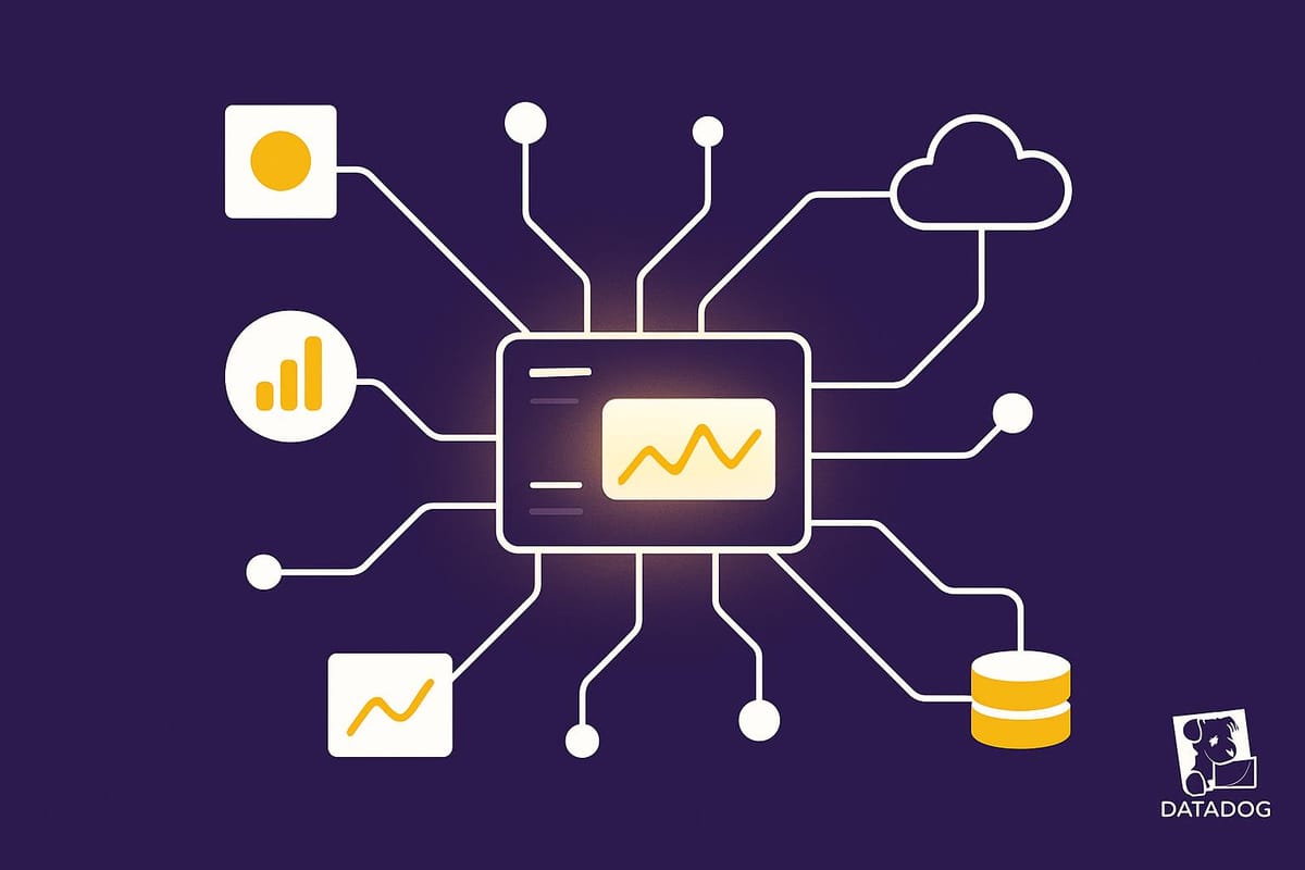
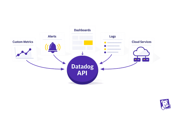
Mapping application dependencies is crucial for understanding how your services interact, detecting issues, and maintaining system performance. Datadog simplifies this with its Service Map, an automated tool that visualizes real-time connections between services, databases, APIs, and more.
Key Benefits of Datadog's Service Map:
- Automatic Dependency Mapping: No manual updates; it continuously reflects changes in your architecture.
- Real-Time Insights: Visualize traffic flow, service health, and bottlenecks instantly.
- Integrated Troubleshooting: Dive into logs, traces, and metrics directly from the map.
- Cluster Views: Groups related services for easier analysis of critical areas.
- Custom Filters: Focus on specific services, teams, or incidents for clear problem-solving.
How to Get Started:
- Enable Datadog APM: Deploy the Datadog Agent and instrument your applications to send trace data.
- Access the Service Map: Navigate through the Datadog dashboard to view your system's architecture.
- Monitor and Troubleshoot: Use health indicators, filters, and dependency views to identify and resolve issues quickly.
The Service Map provides a dynamic, visual representation of your system, helping you manage dependencies, prevent downtime, and improve performance across your environment.
Introducing the Datadog Service Map
Setting Up the Datadog Service Map
Now that you know what the Service Map can do, let’s go over how to set it up. If Datadog APM is already configured in your environment, you’re almost there. The Service Map automatically pulls in data that APM collects, making the setup process simple.
Enable Datadog APM in Your Environment
To get started, you’ll need to enable APM, which allows the Service Map to visualize your trace data automatically.
First, deploy the Datadog Agent in your environment. The Agent serves as the connection point between your applications and Datadog’s platform, collecting trace data along with other telemetry. Once the Agent is up and running, you can instrument your applications. Datadog provides tracing libraries for most programming languages, allowing for an easy setup with minimal code changes. These libraries detect common frameworks and databases, automatically mapping how requests flow through your system. If you need more control, you can use OpenTelemetry SDKs for custom instrumentation. Once your applications begin sending trace data, the Service Map starts building its visualization.
For a broader view of your system, Universal Service Monitoring (USM) automatically detects all services in your architecture, regardless of the programming language used. This feature ensures that every service is included in the Service Map without requiring manual configuration.
With APM enabled, head to the Datadog dashboard to access and explore the Service Map.
Access and Navigate the Service Map
Finding the Service Map in Datadog is straightforward. From your dashboard, go to "Application Performance" > "APM" > "Service Observability" > "Service Map". Once APM is configured, the Service Map is ready to use.
When viewing the Service Map, you’ll find several ways to interact with it. Use filters to narrow your focus - filter by service name or hover over a specific service to highlight it. Clicking on a service node isolates it, showing its immediate dependencies. Services that rely on it are displayed to the left, while services it depends on appear to the right. You can also pivot your view by selecting an upstream or downstream node, shifting the map to focus on that service and its connections.
If you’ve added team and application metadata to your services in the Service Catalog, you can group the Service Map by these categories. This helps identify which teams are responsible for different parts of your system. Additionally, you can filter by incident status to focus on services involved in ongoing or resolved incidents.
Now, let’s break down the key visual elements of the Service Map to help you interpret its layout.
Understanding Service Map Components
The Service Map uses a variety of visual elements to represent your system’s architecture. Familiarizing yourself with these components will help you make sense of the data.
- Nodes represent individual services, such as web servers, databases, APIs, or third-party services.
- Arrows illustrate the observed dependencies between services. These connections are based on real traffic patterns, showing how data flows through your system.
- Clustering groups closely related services together based on the volume of interactions between them. Services with dependencies outside a cluster are generally positioned at the cluster’s edge, highlighting potential bottlenecks or overburdened services.
Each service node is surrounded by a colored ring, which indicates the most severe monitor status for that service. This provides a quick visual snapshot of service health, allowing you to identify issues at a glance.
Clicking on a node opens a detailed side panel. Here, you can view incident data, resource details, recent deployments, and endpoint health. The side panel also allows you to dive deeper by investigating individual traces, reviewing processed logs, or analyzing infrastructure metrics.
You can customize the Service Map’s topology by grouping services based on team or application metadata. This flexibility lets you view your architecture from different angles, whether you’re troubleshooting an issue or trying to understand service ownership.
Analyzing Application Dependencies
Once your Service Map is up and running, it's time to dig into the visual data. This step is all about examining your application's dependencies and tracking how they evolve over time - a critical process as your system grows and changes.
Identify Service Connections
Your Service Map can uncover connections you might not have noticed before. Pay close attention to the colored rings around services - they indicate alert states. For instance, a red or yellow ring signals an issue that needs immediate attention, as these services are critical dependencies.
Look for key services located at the edges of clusters or those with numerous connections. These are often potential bottlenecks. Clicking on a node allows you to explore both upstream and downstream dependencies, giving you a clearer picture of how issues in one service might ripple through others.
Also, review call volumes and the relationships between services. Clusters often represent high-traffic connections, highlighting your most essential dependencies. As you assess these, don't forget to consider the Service Level Objectives (SLOs) of the connected services. For example, if your service aims for 99.999% uptime but relies on another service with only 99.9% availability, that could be a weak point in your architecture. Identifying these mismatched SLOs can help you address vulnerabilities and strengthen your system's reliability.
Monitor Dependencies in Real Time with Datadog
With the Service Map in action, real-time monitoring transforms dependency analysis from a static snapshot into a dynamic dashboard that actively supports your application's health. This continuous oversight is key to catching potential issues before they escalate, helping to avoid costly downtimes that can impact revenue and customer trust. Here's how you can make the most of these insights in real time.
Set Alerts for Critical Dependencies
Use the insights from your dependency analysis to set up precise alerts for services that play a critical role in your application's performance. Focus on metrics like error rates, latency, and throughput drops to identify potential trouble spots.
For better accuracy, configure composite monitors to track multiple metrics at once. For instance, you could set an alert to trigger if a critical service shows both a spike in error rates and slower response times within a short window. This approach reduces false alarms and ensures you catch real problems early.
Adjust alert thresholds to align with your service level objectives (SLOs). If your application has a high uptime target but relies on services with lower availability, tighten the alert conditions for those dependencies. This proactive adjustment gives you more time to address issues before they ripple across your system.
Finally, implement escalation policies that match your team's capacity. Many organizations use a tiered system - starting with immediate notifications and escalating if the issue persists.
Use the Service Map for Live Dependency Monitoring
Beyond setting up alerts, the Service Map itself is a powerful tool for live monitoring. Acting as a command center, it provides real-time visibility into your dependency network during both routine operations and incidents. Health indicators on the map highlight the status of each service, saving you the hassle of jumping between multiple dashboards.
During high-traffic periods or deployments, keeping the Service Map open allows you to see how changes affect your dependencies. Visual cues, like shifts in traffic flow or thickening connection lines, can help you identify bottlenecks before they become critical.
The time range selector lets you compare current performance with historical data, which is especially useful for spotting unusual behavior during seasonal spikes or after infrastructure updates. If a service shows signs of trouble, the drill-down feature allows you to investigate specific metrics while maintaining a clear view of the overall dependency network. This helps you understand both the immediate issue and its broader impact.
Methods for Continuous Monitoring
A combination of automated alerts and manual reviews ensures the most effective monitoring. Each method has its strengths:
| Monitoring Method | Reliability | Efficiency | Resource Requirements | Best Use Cases |
|---|---|---|---|---|
| Automated Alerting | High – monitors 24/7 | Very High – instant notifications | Low – minimal effort after setup | Critical services, off-hours, SLA-sensitive tasks |
| Manual Service Map Reviews | Medium – depends on review frequency | Medium – requires dedicated time | High – needs regular staff attention | Complex issues, trend analysis, post-incident reviews |
| Scheduled Health Checks | Medium – limited to set intervals | High – systematic and predictable | Medium – automated but requires maintenance | Non-critical services, compliance, trend tracking |
Automated alerting is essential for critical dependencies where even minor disruptions can impact customer experience or revenue. Set thresholds based on your real-world performance data to ensure alerts are both relevant and actionable.
Manual reviews of the Service Map are perfect for uncovering complex interdependencies or gradual performance shifts that might not trigger alerts. Scheduling these during quieter periods allows your team to focus on identifying patterns and trends without the stress of active issues.
Use the Service Map for Troubleshooting and Incident Response
The Service Map is more than just a monitoring tool - it’s your go-to resource for handling incidents efficiently. When problems arise, it offers a clear, visual representation of your system, helping you quickly identify affected services and any cascading issues. This bird’s-eye view is essential for making fast decisions and coordinating your team’s response under pressure.
Identify Affected Services During Incidents
Real-time health indicators on the Service Map - red for critical issues and yellow for degraded performance - immediately highlight the scope of an incident.
Start by analyzing traffic flow patterns around the impacted services. Thicker lines between services indicate higher traffic volumes, while broken or thin lines may point to communication failures. For instance, if your authentication service is flagged with a red status, you can trace its dependencies to see which downstream services, like user dashboards or API endpoints, are also impacted.
The time range selector can be a game-changer during incidents. By setting it to show the moments leading up to the issue, you can identify changes and spot early signs of cascading failures. Filtering by service groups or specific environments lets you zero in on the most relevant data, saving precious time.
Once you’ve pinpointed the affected services, you can dive deeper to uncover the root cause using the Service Map’s detailed insights.
Trace Root Causes with Service Maps
After identifying the affected services, the Service Map becomes your guide for investigating root causes. Clicking on any service node gives you access to detailed metrics, logs, and traces, all while keeping the bigger dependency picture in focus.
Work backward along the dependency chain from the user-facing service showing errors. For example, if your web application is throwing 500 errors, trace its connections to find which backend service might be causing the issue. The Service Map simplifies this process by showing dependencies several layers deep, making it easier to untangle complex architectures.
The trace correlation feature is especially useful here. It links service-level problems to specific request traces, letting you pinpoint the exact failure. Performance overlays, like high latency or elevated error rates, provide visual clues that help you focus on the most likely problem areas.
Once you’ve identified the root cause, it’s time to document your findings and standardize your approach for future incidents.
Document Incident Response Workflows
Use the insights from the Service Map to create standardized workflows for incident response. The visual indicators and patterns you’ve identified can form the foundation of a consistent troubleshooting process, ensuring that every team member follows the same approach, regardless of who’s on call.
Centralize all incident-related data - like Service Map screenshots and dependency analyses - into a shared location, such as Datadog’s incident timeline. This creates a single source of truth during active incidents and provides valuable context for post-incident reviews.
Automate your postmortem templates to include Service Map states, incident metadata, live graphs, and key dependency details. This reduces manual work and ensures consistent documentation across incidents. Collaborative tools like Datadog Notebooks can further enhance your documentation by allowing responders to include interactive graphs and adjust timeframes or filters for deeper analysis.
Tag your incident records with service names to make it easier to find historical incidents tied to specific dependencies. This service-focused tagging turns your Service Map insights into a searchable knowledge base, helping your team respond faster to similar issues in the future.
Finally, export your incident documentation in formats like PDF or Markdown to preserve your analysis beyond Datadog’s standard data retention periods. This ensures that valuable lessons from past incidents remain accessible when you need them most.
Key Takeaways on Mapping Dependencies in Datadog
For SMBs managing intricate cloud setups, application dependency mapping is a must. Datadog's Service Map simplifies this process by creating a real-time visualization that evolves alongside your infrastructure. This dynamic tool ensures you’re not left guessing how services interact, especially during critical incidents.
The real power of the Service Map lies in its ability to connect monitoring with actionable insights. When outages occur, you gain instant visual clarity on which components are impacted and how issues ripple across your system. This real-time visibility can drastically reduce response times, which is crucial when every second counts.
But the advantages go beyond just handling outages. The Service Map acts as living documentation, automatically reflecting changes as new services are deployed or existing ones are updated. This eliminates the need for manually maintaining static architecture diagrams, which often become obsolete in fast-paced development cycles.
To get started, enable APM for your most critical services and gradually expand coverage. Configure alerts for key dependencies to stay ahead of potential issues. Keep in mind that dependency mapping isn’t a one-and-done task - it’s a process that evolves as your system grows.
For smaller teams juggling multiple responsibilities, the Service Map offers both proactive monitoring and reactive troubleshooting tools. It’s a comprehensive solution for understanding, documenting, and responding to your application architecture as it adapts to your business needs.
Finally, leverage the insights from your Service Map to build a deeper understanding within your team. The patterns you uncover, workflows you refine, and relationships you document will strengthen your system’s resilience and scalability. Let these insights guide your monitoring strategy as your infrastructure continues to evolve.
FAQs
How does Datadog's Service Map keep up with changes in my application's structure?
Datadog's Service Map keeps itself current by dynamically analyzing your application's architecture and mapping out services and their dependencies in real time. With Universal Service Monitoring (USM) enabled, it automatically detects all services, no matter the programming language.
By leveraging request traces, the Service Map illustrates how services interact with one another, continuously updating to reflect any changes in your system. This ensures you always have a clear, up-to-date view of your application's architecture, making it easier to monitor dependencies and adjust to updates as they happen.
How can I troubleshoot an incident and find the root cause using the Service Map in Datadog?
To address an issue using the Datadog Service Map, begin by opening the map to get a clear view of your services and their current health. This visual overview makes it easier to spot any areas experiencing problems.
Once you've identified the affected service, take a closer look at its connections and dependencies. The Service Map visually outlines how services interact and includes key health metrics, helping you trace the problem back to its source. By isolating the impacted service and examining its relationships, you can quickly determine the root cause and work toward resolving the issue, cutting down on resolution time.
This method allows you to tackle problems efficiently, keeping your systems running smoothly.
How can I tailor the Service Map in Datadog to focus on specific teams or incidents, and what are the advantages of doing so?
You can tailor the Datadog Service Map using tags such as env:prod or team:frontend to better organize and manage your services. These tags make it simple to filter the map, allowing you to zero in on specific teams or environments. This way, you can easily monitor the dependencies that matter most.
When paired with Datadog Incident Management, this customization becomes even more powerful. You can filter the map by incident status, making it easier to spot impacted services during outages. This streamlines troubleshooting, helps you prioritize responses, and cuts through the noise, giving you a clearer picture and faster paths to resolution.