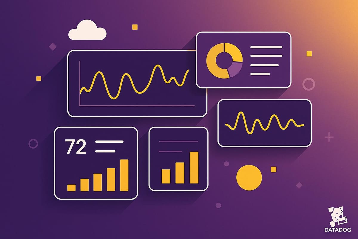
Ultimate Guide to Datadog Dashboard Performance
Optimize your dashboards for faster insights and improved performance with practical strategies and advanced features.
Want faster, clearer insights from your Datadog dashboards? Here's how you can optimize performance to make better decisions, reduce downtime, and improve system monitoring.
Key Takeaways:
- Faster Dashboards: Speed up load times by limiting widgets to 15–20 per view and optimizing queries.
- Better Organization: Group metrics logically (e.g., overviews, key indicators, logs) for easier navigation and troubleshooting.
- Smarter Visuals: Use time series charts, tables, and color strategies to highlight trends and critical data.
- Efficient Data Management: Filter, aggregate, and set retention policies to balance performance and historical data needs.
- Advanced Features: Use dashboard linking, synthetic monitoring, and usage statistics to enhance usability and detect issues early.
Quick Wins:
- Optimize Query Performance: Reduce latency by filtering unnecessary data and grouping logs.
- Refine Layouts: Use Datadog's grid system and align widgets for intuitive navigation.
- Leverage Dashboard Linking: Break large dashboards into smaller, linked views to reduce load times.
By following these steps, you can turn your Datadog dashboards into a powerful tool for real-time insights and operational efficiency.
I06 Build Datadog Dashboards That Actually Help During Outages (Complete Guide)
Dashboard Design Fundamentals
When it comes to dashboards, good design is key to making data easy to understand and act upon. By focusing on a few core principles, you can ensure your dashboard delivers clear and actionable insights.
Metric Organization Methods
The way you organize metrics can make or break a dashboard's usability. A well-structured dashboard flows logically, starting with broad overviews and narrowing down to more detailed data. Here's how you can group metrics effectively:
| Group Type | Purpose | Key Components |
|---|---|---|
| About | Provides context | Description, documentation links |
| Overview | High-level health check | Service checks, monitor summary |
| Core Metrics | Tracks key indicators | Performance KPIs, system vitals |
| Logs | Focuses on error tracking | Status timeseries, critical log stream |
To make troubleshooting easier, follow an upstream-to-downstream approach. This method ensures users can trace issues back to their source, streamlining the debugging process and improving efficiency.
Widget Selection Guide
Choosing the right widgets for your dashboard is just as important as organizing your metrics. Time series charts are a great starting point for most data sets, as they illustrate trends over time. But don’t stop there - experiment with different visualizations to find the best fit. For example, you can clone a time series widget and test other visual options without altering the original.
For more complex data, consider mixing widget types:
- Time series charts for tracking trends and patterns
- Tables for detailed metric breakdowns
- Top lists for spotting outliers quickly
- Status boards for monitoring critical service health
The way you arrange these widgets also plays a big role in making your dashboard intuitive, which leads us to layout and color strategies.
Layout and Color Best Practices
A well-thought-out layout can significantly enhance your dashboard’s performance and ease of use. Here are some tips to keep in mind:
-
Grid Structure
Use Datadog's 12-column grid system to keep things organized:- Dedicate at least 4 columns for time series widgets.
- Assign 6 or more columns to stream widgets, like logs.
- Group related widgets together, even if the group contains just one widget.
-
Visual Hierarchy
Arrange metrics in a way that creates a logical flow. For instance, placing network metrics next to server performance metrics can help users quickly connect the dots. -
Color Strategy
Consistent use of colors helps users:- Spot critical metrics instantly.
- Identify trends and patterns faster.
- Minimize mental effort during analysis.
Query Performance Optimization
Speeding up query performance is key to building responsive dashboards. By applying targeted strategies, you can cut down load times and improve overall efficiency.
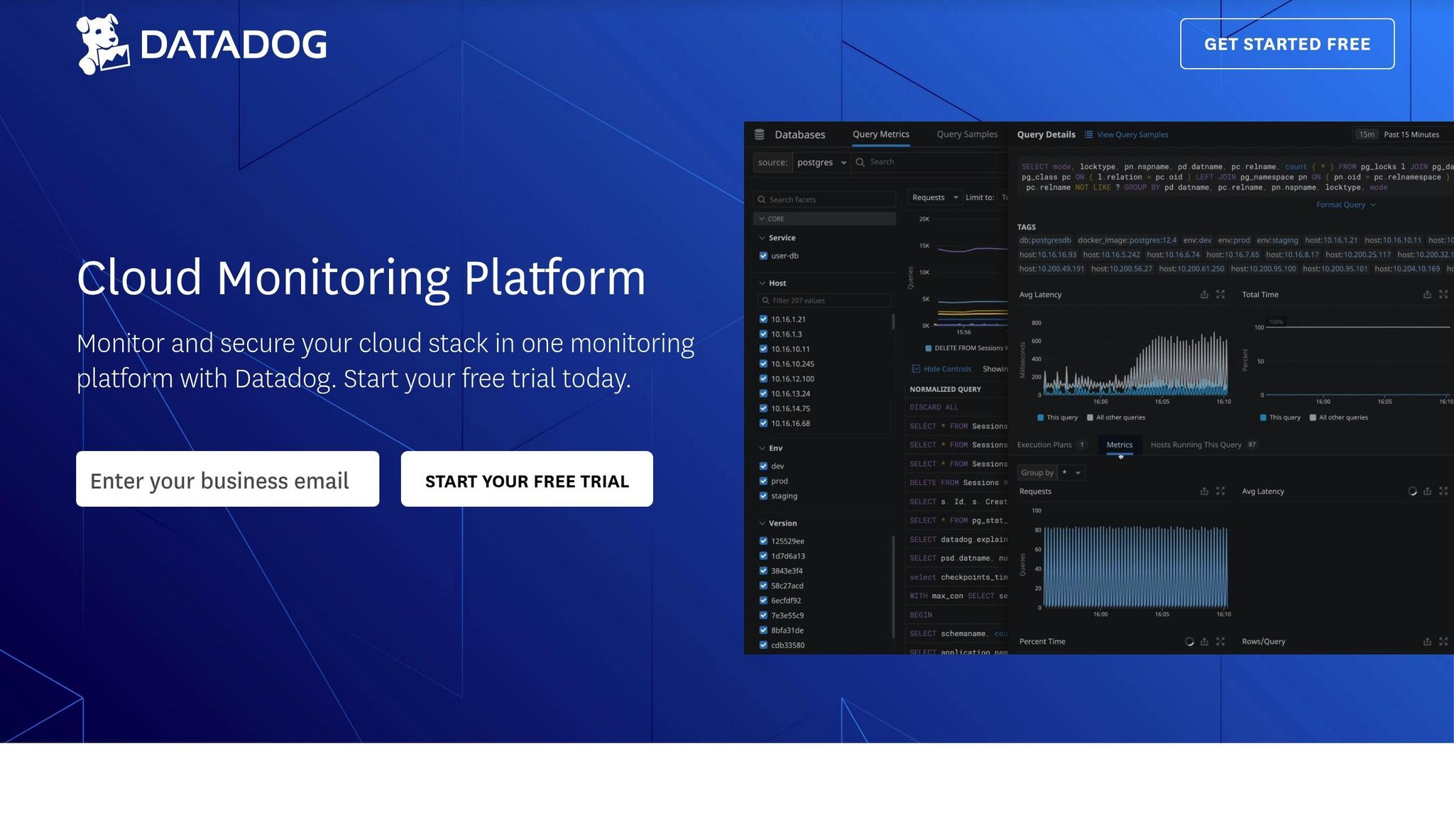
Finding and Fixing Slow Queries
Datadog's Database Monitoring tools are designed to help you quickly identify and resolve bottlenecks. The Query Metrics dashboard provides a clear view of normalized query performance across your entire infrastructure. Start by keeping an eye on metrics like query latency, resource usage, and execution frequency. Using Datadog's explain plans, you can visualize execution paths, making it easier to spot inefficient operations within complex queries.
Data Filtering and Aggregation
One DevOps team managed to cut their log volume in half by grouping identical errors, adjusting log levels, sampling logs, and filtering out nonessential data.
Here are some strategies to improve data filtering:
| Strategy | Implementation | Impact |
|---|---|---|
| Edge Filtering | Filter data before it leaves your environment | Reduces data transfer and processing overhead |
| Selective Routing | Route logs based on priority | Optimizes storage costs and query efficiency |
| Metadata Management | Remove null fields and normalize data | Enhances query performance |
Data Retention Settings
Adjusting data retention settings helps strike a balance between keeping historical data and maintaining performance. Tailor retention periods to the importance of the data. For example, keep critical metrics longer, apply aggressive aggregation to high-volume data, and use shorter retention for debug logs while archiving them for reference.
Here’s a breakdown of targeted retention strategies:
| Data Type | Retention Strategy | Performance Impact |
|---|---|---|
| Error Logs | Hot storage, 30-day retention | Ensures quick access to recent issues |
| System Metrics | Aggregated after 7 days | Maintains a balanced historical overview |
| Debug Data | 24-hour retention | Reduces performance overhead significantly |
Advanced Dashboard Features
Enhance the performance and usability of Datadog dashboards with advanced tools and techniques designed to optimize functionality and streamline user interactions.
Dashboard Linking Strategies
Efficient dashboard linking can simplify navigation and improve overall performance. Instead of cramming all metrics into a single dashboard, distribute related metrics across interconnected dashboards. This approach reduces load times and ensures a smoother user experience.
A hierarchical structure can help organize dashboards effectively. Here are some useful linking methods:
| Linking Method | Use Case | Performance Benefit |
|---|---|---|
| Tag Variables | Environment-specific views | Limits query scope, reducing load times |
| Multi Alerts | Incident response | Enables context-aware navigation |
For example, you can use tag variables like {{host.availability-zone}} or {{host.env}} in URL query strings to guide users to pre-filtered dashboards tailored to their needs.
In addition to linking strategies, incorporating proactive monitoring tools can further enhance performance.
Synthetic Monitoring Integration
Synthetic monitoring helps keep a constant eye on critical workflows, server response times, and transaction success rates. By doing so, it can detect performance issues before they impact users.
Dashboard Usage Statistics
While synthetic monitoring flags potential problems early, usage statistics provide insights into how dashboards perform in real-world conditions. Analyzing these metrics can guide improvements to enhance both functionality and user experience.
Key metrics to monitor include:
| Metric | Purpose | Action Items |
|---|---|---|
| View Frequency | Identifies usage patterns | Remove or update widgets that are rarely accessed |
| Load Times | Tracks performance efficiency | Prioritize optimization of high-traffic dashboards |
| User Engagement | Measures feature utilization | Consolidate or improve underused elements |
Evaluating these metrics allows for targeted updates, ensuring dashboards remain relevant and efficient.
"Auditing dashboard activities is paramount to prevent them from becoming obsolete/forgotten and to also make space for improvement both usage-wise and dashboard quality wise."
– -W-, Contributor, HubSpot Community
Real-world examples illustrate the value of these insights. For instance, HubSpot administrators used dashboard usage statistics to identify which dashboards were actively referenced. This enabled them to make informed decisions about resource allocation, focusing on frequently accessed dashboards while archiving or updating outdated ones. This data-driven approach ensures resources are directed where they’re needed most, maintaining dashboard quality and relevance.
Dashboard Management and Updates
When it comes to managing dashboards effectively, it’s not just about creating them - keeping them relevant and collaborative is equally important. Studies show that around 70% of data metrics become outdated within six months. To tackle this, focusing on teamwork, structured updates, and feature adoption is essential. Let’s dive into how these elements can streamline dashboard management.
Team Input and Collaboration
A well-managed dashboard thrives on team involvement and constructive feedback. Organizations that adopt collaborative monitoring strategies often see noticeable gains in efficiency. Here’s a quick look at how different collaboration methods can make an impact:
| Collaboration Method | Impact | Implementation Time |
|---|---|---|
| Real-time Communication Integration | 40% reduction in resolution time | 1–2 weeks |
| Role-based Dashboard Views | 30% increase in productivity | 2–4 weeks |
| Regular Team Reviews | 60% fewer outages | Ongoing |
For example, a March 2025 study by the MoldStud Research Team revealed that real-time alerting can improve team responsiveness by 50%. Their research emphasized the importance of customizable dashboards that highlight critical metrics like server response times and application performance.
"Enhancing your team's collaboration is also pivotal. Tools such as Slack or Microsoft Teams can be integrated seamlessly with monitoring software, enabling real-time communication about alerts and incidents. Recent findings show effective communication can reduce resolution time by up to 40%. Ensure accountability by assigning roles for incident resolution and post-mortem processes, fostering a culture of shared ownership and learning." - Grady Andersen & MoldStud Research Team
Dashboard Change Control
Keeping dashboards functional and accurate requires a solid change control strategy. Here are the key components:
- Change Control Board (CCB): Regular meetings with team representatives to approve and discuss dashboard updates.
- Documentation Protocol: Maintain detailed logs of every modification, including justifications and potential impacts, to simplify troubleshooting.
- Testing Framework: Test changes thoroughly before deployment to ensure stability and data accuracy.
"The most important aspect of a Change Management dashboard is a feedback mechanism because it promotes continuous improvement, user satisfaction, and effective communication, ultimately contributing to the success of the overall change initiative."
By combining these strategies with feedback loops, teams can ensure dashboards remain relevant and functional.
New Datadog Features
Leveraging the latest tools can take dashboard management to the next level. Datadog offers several features designed to enhance performance:
- Fleet Automation: Simplifies the centralized management of Datadog Agents and configurations.
- Disaster Recovery (DDR): Ensures observability even during outages.
- API-Driven Updates: Automates dashboard changes in response to deployment or metric updates.
To stay ahead, schedule regular reviews to incorporate these updates into your workflows.
Conclusion: Dashboard Performance Checklist
Efficient monitoring can cut downtime by up to 50%. Let’s take a closer look at the key factors that contribute to creating effective Datadog dashboards.
Here’s a quick summary of important performance metrics and their impact:
| Performance Factor | Impact | Recommended Action |
|---|---|---|
| Widget Load Time | 70% of users abandon slow-loading dashboards | Keep widgets limited to 15–20 per view |
| Clear Visuals | Improves data retention by 80% | Eliminate redundant elements |
| Optimized Filtering | Boosts operational efficiency by 30% | Use custom tags and groupings |
These metrics highlight actionable steps to improve dashboard performance. For example, at dx.one – Volkswagen Group, standardizing dashboards across over 2,000 AWS accounts led to measurable gains. Through automated governance and consistent monitoring, they achieved better performance outcomes.
To further enhance dashboard responsiveness, focus on these three areas:
- Data Management: Set up retention policies that balance responsiveness with the need to preserve historical data.
- Visual Optimization: Prioritize key metrics and remove clutter to streamline dashboard views.
- Query Efficiency: Adjust timeframes and sampling rates based on the type of metrics being monitored.
Optimized dashboards don’t just improve technical performance - they also enable smarter decision-making. Companies with clearly defined metrics see a 30% improvement in overall performance. By refining your dashboards, you’re not just enhancing functionality - you’re empowering your team to make faster, better-informed decisions.
FAQs
How can I manage data retention in Datadog dashboards to improve performance while keeping essential historical data?
To handle data retention in Datadog dashboards effectively, it's all about striking the right balance between performance and maintaining access to historical data. Start by cutting down on storage usage - filter out logs you don’t need, like debug logs, to keep your dashboards running smoothly.
You can also set up custom retention rules to manage costs and accessibility. For example, keep critical logs for 30 days while archiving less important data for longer periods. Tag-based retention policies are another great option - they let you focus on keeping essential data while clearing out less relevant information.
Another smart move? Adjust data rollups. Use lower resolutions for older data to save on storage while still holding onto the insights you need. These strategies can help you maintain a high-performing dashboard while ensuring the data you care about most is always within reach.
What are the best ways to organize metrics in Datadog dashboards for better usability and faster troubleshooting?
To make your Datadog dashboards more effective and easier to use, focus on logical organization of metrics. Group similar metrics together - like application performance stats or infrastructure health indicators - so patterns and potential issues stand out more clearly. Keep dashboards clean and focused by displaying only the most relevant metrics, such as key performance indicators (KPIs), to avoid unnecessary clutter.
A consistent layout and color scheme across all dashboards can make navigation smoother and reduce mental strain. It’s equally important to regularly review and update your dashboards to ensure they align with your team’s evolving goals and reflect any system updates. This regular upkeep ensures your dashboards remain practical and actionable.
How can features like synthetic monitoring and dashboard linking enhance the performance and usability of Datadog dashboards?
Advanced tools like synthetic monitoring and dashboard linking can take the performance and usability of Datadog dashboards to the next level.
With synthetic monitoring, you can mimic how users interact with your applications. This helps you catch potential issues early - before they affect real users. By ensuring key features remain functional and downtime is minimized, you can deliver a smoother, more reliable experience for your audience.
Meanwhile, dashboard linking streamlines the process of navigating between related data or dashboards. By linking widgets to relevant metrics or dashboards, it becomes easier to analyze patterns, identify problems, and resolve them faster. These features work together to help teams keep their monitoring systems efficient and user-friendly.