Widget Configuration Checklist for Datadog
Learn how to effectively configure Datadog widgets for actionable insights, streamlined performance, and enhanced monitoring capabilities.
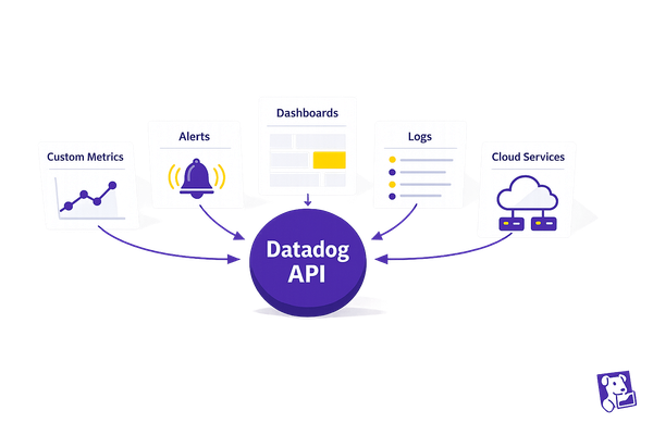
Datadog dashboards are only as good as the widgets you configure. Misconfigured widgets can lead to confusion, wasted time, and missed insights. Here’s how to set them up for clear, actionable data:
- Start with Clear Goals: Know the purpose of your dashboard - e.g., monitoring server health or tracking app performance. Choose widgets that align with these goals.
- Verify Your Data: Ensure Datadog collects the right metrics with consistent tags and integrations. Document performance baselines to set realistic thresholds.
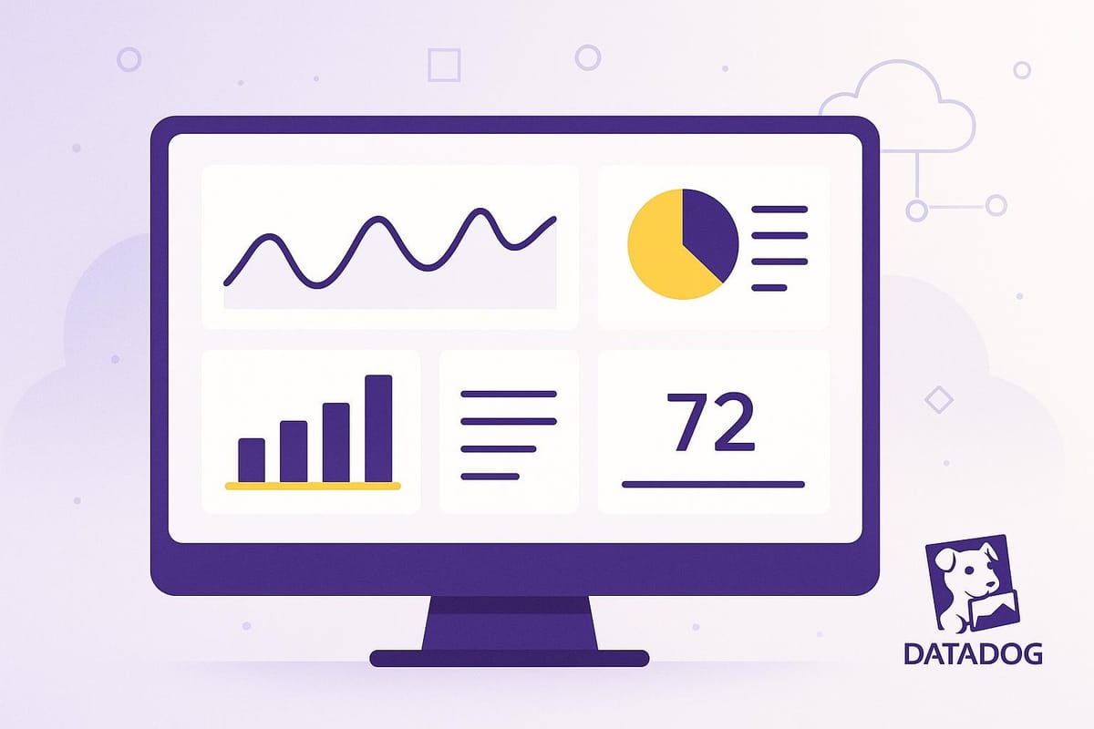
- Choose the Right Widget Types:
- Timeseries: For trends over time (e.g., CPU usage).
- Query Value: For single, critical metrics (e.g., error count).
- Heatmap: For spotting infrastructure hotspots.
- Distribution: For understanding data spread and outliers.
- Optimize Performance: Limit widget count, use template variables for filtering, and set appropriate refresh rates to avoid slow dashboards.
- Maintain Dashboards: Fix widget errors, review access rights, and update dashboards regularly to ensure relevancy.
Properly configured widgets turn raw data into meaningful insights, helping teams make smarter decisions and keep systems running smoothly. Start by defining your goals, verifying your data, and selecting the right widget types to create dashboards that work for you.
Datadog on Data Visualization
Before You Configure Widgets
Before diving into the widget configuration panel, take a moment to plan your setup. A little preparation can save you from creating dashboards that look great but fail to provide actionable insights.
Set Clear Dashboard Goals
Every dashboard has a purpose - whether it’s monitoring infrastructure, tracking application performance, or analyzing logs. The widgets you choose should align with that purpose. For example, a server health dashboard doesn’t need application error logs, and a performance dashboard might not require network traffic data.
Start by identifying the decisions your dashboard needs to support. For instance, an operations team might need widgets showing server CPU usage, memory consumption, and disk space. Meanwhile, a development team might focus on application response times, error rates, and deployment frequency.
Think about the key questions your dashboard should answer. These questions will guide your widget selection and help you avoid cluttering the dashboard with unnecessary visualizations. Once you’ve outlined these goals, ensure your data sources can support them.
Check Your Metrics and Data Sources
Before configuring widgets, confirm that Datadog is collecting the data you need.
Use Datadog's Metrics Explorer to locate the metrics you plan to include. Verify that the data is flowing consistently and that timestamps are up-to-date. If you’re working with custom application metrics, ensure your application is sending them to Datadog without issues.
Pay close attention to metric naming conventions and tagging structures. For example, if your infrastructure uses tags like environment:production or service:web-app, make sure these tags are applied consistently. Widgets rely on these tags for filtering and grouping, so inconsistencies can lead to incomplete or confusing visualizations.
Additionally, check that all necessary integrations are functioning properly. For example, if your dashboard requires database performance metrics, confirm that your database integration is active and sending data. The same applies to cloud provider integrations, log collection, and other third-party services. Once you’ve verified data collection, document performance baselines to give context to your widget metrics.
Record Current Performance Baselines
Performance baselines help you understand normal system behavior and set meaningful alert thresholds.
Document key metrics - such as average response times, CPU and memory usage, error rates, and throughput - from the past 30 days. These baselines provide a reliable reference point for your widgets.
For instance, if your web application typically handles 1,000 requests per minute during business hours with an average response time of 200 milliseconds, these figures become your baseline. Use them to configure alert thresholds that reflect real-world performance.
Keep in mind any seasonal or cyclical patterns in your data. For example, an e-commerce platform might experience traffic spikes during lunch hours or weekends, while a B2B application could see quieter periods on weekends. Understanding these patterns ensures your thresholds are realistic and helps reduce false alarms.
Document baseline metrics for different components separately. For example, a software company might track customer support performance with baselines like a 2-day average ticket resolution time, a 4-hour first response time, and an 85% customer satisfaction score. These baselines provide clear guidance for widget configuration and threshold settings.
Make this documentation easily accessible to your team. When someone needs to adjust widgets or investigate performance issues, having these reference points on hand saves time and ensures consistency across your monitoring setup. Baselines are a crucial foundation for setting thresholds and building effective dashboards.
Widget Setup Checklist
Once your goals are clear and your data is verified, it’s time to configure your widgets. This involves selecting the right widget type, defining metrics and filters, and setting up visualization options with thresholds that make sense for your monitoring needs.
Select the Right Widget Types
Choosing the right widget type is key to making your data meaningful and actionable. Here’s a breakdown of common widget types and their uses:
- Timeseries widgets: These are perfect for tracking trends over time, such as CPU usage, memory consumption, or response times. They help you spot patterns and changes at a glance.
- Query Value widgets: Ideal for displaying single, critical metrics that need immediate attention. For example, you can use them to monitor active user count, total errors in the last hour, or available disk space.
- Heatmap widgets: Use these to visualize patterns in large datasets. They’re especially helpful for identifying hotspots in your infrastructure, such as which servers are under the heaviest load.
- Distribution widgets: These show how your data spreads across different ranges, making it easier to understand percentiles and outliers. For instance, they can highlight whether most API requests are processed quickly or if a few are causing delays.
Match the widget type to your specific goal. Timeseries widgets are great for trends, query value widgets for key performance indicators, heatmaps for identifying problem areas, and distribution widgets for analyzing data spread.
Configure Metrics and Filters
To make your widgets effective, you need to configure metrics and apply filters that focus on the data you care about most.
-
Define specific metrics: Use Datadog's metric syntax to zero in on the data you need. For example,
avg:system.cpu.user{*}shows average CPU usage, whilesum:nginx.requests{*}tracks total web server requests. Choose an aggregation method - such as average, sum, maximum, or minimum - based on what you’re trying to monitor. -
Apply filters: Use tags like
env:prodorservice:web-appto focus on specific environments or services. Combine tags (e.g.,env:prod AND service:database) to create targeted views that meet your monitoring needs. -
Balance filter scope: Broad filters like
{*}can provide a comprehensive view but might overwhelm your widget. Narrow filters, on the other hand, deliver focused insights but could miss the bigger picture. Aim for a balance that works for your use case. -
Group metrics for comparison: When dealing with multiple data sources, group metrics by dimensions like
hostoravailability_zone. This helps you compare performance across instances and quickly identify any weak spots.
Always test your metric configurations using Datadog’s preview feature to ensure everything displays as expected. Pay attention to units and scaling - converting bytes to gigabytes or similar adjustments can make your data much easier to interpret.
Customize Visualization Options and Thresholds
Fine-tuning your visualization options ensures your dashboards are not just informative but also actionable.
- Set unit conversions: Make your data easier to read by converting units. For example, display storage metrics in gigabytes instead of bytes or response times in seconds instead of milliseconds.
- Define alert thresholds: Use your baseline performance metrics to set thresholds. For instance, if your average CPU usage is 30%, you might set a warning threshold at 70% and a critical threshold at 90%. Color-coded alerts - green for normal, yellow for warnings, and red for critical - make it easy to understand status at a glance.
- Use percentile thresholds: For metrics where outliers matter, such as response times, track percentiles like p95 or p99. While average response times might seem fine, percentiles can reveal occasional delays that impact user experience.
- Standardize your setup: Create templates for common widget types to ensure consistency across dashboards. This saves time and keeps your visualizations uniform.
Finally, make it a habit to review and update your widgets as your infrastructure changes. Regular adjustments ensure your thresholds and visualizations stay relevant and aligned with your evolving monitoring needs.
Improve Widget Performance
To ensure your dashboards load quickly and function effectively, it's essential to fine-tune widget performance. A good starting point? Simplify your dashboard layout.
Control Widget Count
The number of widgets on your dashboard plays a major role in both speed and usability. Cutting down on widgets is one of the easiest ways to boost performance.
Focus on including only widgets that provide actionable insights. While having 20+ widgets might seem thorough, it can slow down both decision-making and system performance. Instead, group related metrics into a single widget to make better use of space. For example, instead of creating separate widgets for CPU usage, memory consumption, and disk I/O for each server, combine these metrics into one widget. This approach keeps your dashboard concise without sacrificing detail.
Also, make it a habit to periodically remove widgets that no longer serve a clear purpose.
Use Template Variables for Filtering
Template variables can make your dashboards more interactive and adaptable. They allow you to filter data across multiple widgets at once, reducing the need for separate dashboards for different environments or services.
Start with an "env" template variable to easily switch between production, staging, and development environments without altering the dashboard structure. These variables appear at the top of your tag list, making them simple to integrate into widgets.
For more granular filtering, use cascading variables. For instance, in a Kubernetes setup, you might first select $cluster for a broad view, then narrow it down with $deployment and $service to focus on specific metrics within that cluster.
To keep things flexible, use the $tempvar.value syntax. For example, if your staging environments are tagged as env:staging-web-store and service:web-store, a single service variable (set to web-store) can automatically pull the right metrics. Similarly, tagging hosts with team ownership details allows a team-based variable to display only the hosts relevant to the selected team. Save these filtered views for scenarios you monitor regularly.
Configure Refresh Rates
Striking the right balance between real-time updates and system performance is key. While frequent updates might seem appealing, they can overload both your dashboard and the Datadog API.
For critical metrics like active user counts or system errors, a refresh rate of 30 seconds works well. However, for less time-sensitive data - such as monthly storage trends - refreshing every 5–10 minutes is sufficient.
Match refresh intervals to how often your data updates. For example, if a metric updates every minute, refreshing every 15 seconds adds unnecessary load without providing new data. To spread out the load, stagger refresh rates slightly - set one widget to update every 30 seconds and another to refresh every 45 seconds.
For dashboards accessed by multiple team members, longer refresh intervals help reduce collective strain. A 2-minute refresh rate, compared to 30 seconds, can significantly cut API calls while still keeping the data timely.
Finally, test refresh rates during normal and peak usage. What works for a small team might not hold up during a high-traffic incident. Start with conservative settings and increase frequency only after confirming your system can handle it smoothly.
Fix Issues and Maintain Dashboards
Dashboards are only as effective as their upkeep. Over time, widgets can run into issues, and dashboards may lose their relevance if not regularly maintained. Keeping them in good shape ensures they continue delivering meaningful insights.
Fix Widget Errors
When widgets fail to display data correctly, the problem often lies in invalid queries or mismatched data types. Start by inspecting the query structure behind the widget. For instance, widget layout coordinates should always use integer values, not floats - this can prevent formatting issues. If you're editing the dashboard manually, double-check that widget positions are set with integers to avoid misalignment.
For complex queries, test them directly in Datadog to verify their accuracy. Export the JSON for automated deployments to catch formatting errors before they affect your workflow. If you encounter issues after updating to a newer API client version, consider temporarily reverting to an older version while investigating the problem. Once the technical glitches are resolved, shift your focus to securing dashboard access to prevent unauthorized changes.
Review Dashboard Access Rights
After fixing widget errors, it's crucial to review who has access to your dashboards. Role-Based Access Control (RBAC) is a reliable way to manage permissions, ensuring that employees only have access to what they need based on their roles. Begin by auditing current permissions - pay special attention to dashboards displaying sensitive data, like production metrics or financial reports.
Separate edit permissions from view-only access, and conduct quarterly reviews to keep permissions up to date as roles shift within your organization. For dashboards containing critical or sensitive information, add extra layers of verification before granting access. Document these approval processes to maintain transparency and accountability.
Keep Dashboards Updated
Once errors are fixed and permissions are sorted, the next step is keeping dashboards relevant. Regularly audit the content to remove outdated metrics and incorporate new priorities as they emerge. Schedule monthly reviews to evaluate the usefulness of widgets and adjust retention policies as needed.
Datadog’s version history feature is a handy tool for tracking changes - users can view modifications from the past 30 days, or up to 90 days with the Audit Trail feature. For more consistent management across environments, consider using code-based tools like Terraform. These tools make it easier to replicate configurations or roll back changes when necessary, ensuring that your dashboards remain consistent and efficient.
Conclusion
Configured widgets elevate Datadog dashboards from simple data displays to powerful tools for business intelligence. By following the key steps outlined - defining clear goals, choosing the right widget types, optimizing performance, and committing to regular updates - you can create dashboards that provide actionable insights instead of overwhelming data.
Prioritize essential metrics such as CPU usage, memory, latency, and error rates. Monitoring these effectively can significantly enhance the performance and reliability of your setup.
Streamline performance by keeping widgets focused, grouping related metrics, and using the most effective visualizations - like timeseries for trends and heatmaps for identifying hotspots. This approach ensures your dashboards remain efficient and insightful.
"Within the first 30 to 45 days, we were able to quickly identify the top five endpoints that had performance issues and reduce response times by 80 to 90%." – Yony Feng, CTO & Co-founder, Peloton
Regular updates are crucial to keeping your dashboards aligned with your evolving business needs. Schedule monthly reviews to assess widget relevance, remove outdated metrics, and integrate new priorities as they arise.
FAQs
How do I make sure my Datadog widgets match my dashboard's goals?
How to Align Datadog Widgets with Your Dashboard Goals
Start by identifying the main purpose of your dashboard. Are you tracking system performance, monitoring user activity, or analyzing specific metrics? Once you’ve nailed down your objectives, pick widgets that effectively showcase the data points tied to those goals. Make sure to use the right metrics and aggregation methods to keep everything clear and easy to understand.
Group related widgets together to create a dashboard that's simple to navigate and visually intuitive. And don’t forget - dashboards aren’t static. Regularly review your widgets and tweak their settings as your priorities or data needs shift. This way, your dashboard stays relevant and continues to deliver the insights you need.
How can I ensure Datadog is collecting accurate metrics and my data sources are reliable?
To ensure Datadog is capturing accurate metrics and your data sources remain dependable, start by confirming that the metrics you’ve chosen align with your monitoring objectives. For instance, use histograms when you need detailed value summaries or APM metrics to monitor application performance, such as request counts and latency.
Additionally, make it a habit to periodically review your data sources. Verify that they’re properly configured and actively transmitting data. Address any misconfigurations or disruptions promptly to keep your dashboards updated with consistent and dependable data.
By staying proactive with these practices, you can keep your Datadog setup running smoothly and your monitoring efforts on point.
How can I use template variables to make my Datadog dashboards more interactive and efficient?
Template variables in Datadog dashboards let you filter data dynamically, adding a layer of interactivity and customization to your dashboards. By setting up variables tied to specific tags or attributes - like hosts or services - you can quickly adjust your view to focus on the most relevant data. This helps you zero in on key metrics and trends while keeping unnecessary information out of sight.
To make your dashboards even more efficient, consider using associated template variables. These work by refining your filters based on earlier selections, ensuring that users only see data that’s directly relevant. This not only improves the clarity of your dashboard but also boosts performance by cutting down on the data being processed. The result? Faster load times and a smoother, more responsive experience. When used thoughtfully, template variables can transform your dashboards into powerful tools that are easy to navigate.