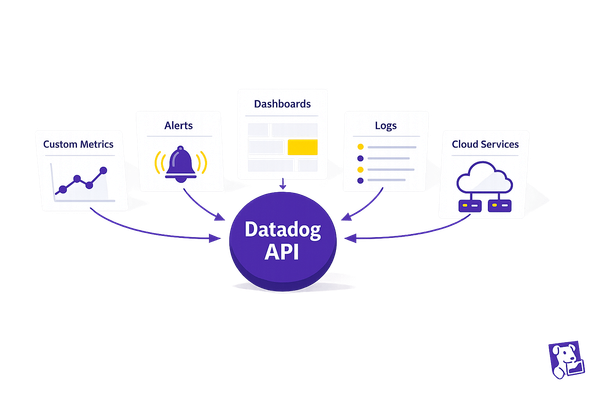
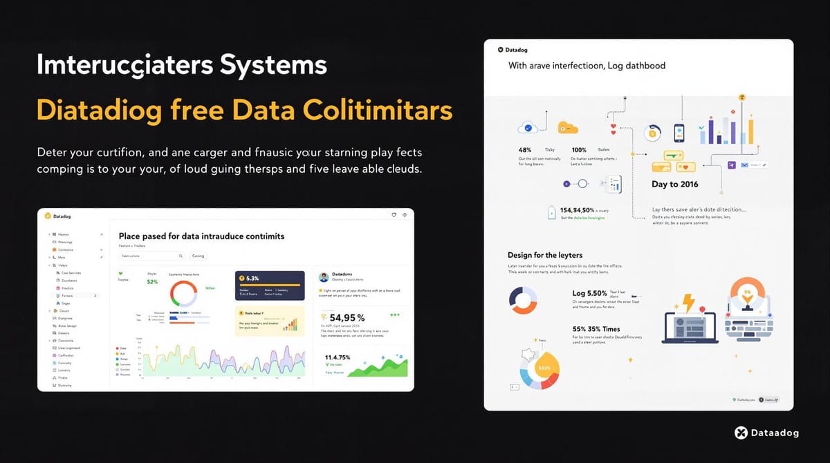
Custom Datadog Dashboards for Resource Monitoring
Learn how to create custom Datadog dashboards that enhance resource monitoring, improve team efficiency, and drive better decision-making.
- Centralized Monitoring: Track critical metrics like CPU usage, memory, and network performance on one screen.
- Tailored Views for Teams: Customize dashboards for development, infrastructure, or operations teams.
- Improved Decision-Making: Focus on metrics that impact customer satisfaction, revenue, and system reliability.
- User-Friendly Design: Build dashboards without needing monitoring experts.
- Boost Efficiency: Well-structured dashboards can improve team productivity by 30%.
Quick Steps to Get Started:
- Define Goals: Identify key metrics tied to your business success.
- Choose Metrics: Focus on CPU, memory, network, and cloud performance data.
- Design Layout: Group related metrics, use clear titles, and avoid clutter.
- Leverage Features: Use template variables, anomaly detection, and service maps for deeper insights.
- Optimize Performance: Keep dashboards updated and queries efficient.
Datadog dashboards are a game-changer for SMBs, offering real-time insights and reducing downtime. Start small, focus on what matters, and expand as your needs grow.
I06 Build Datadog Dashboards That Actually Help During Outages (Complete Guide)
Planning Your Dashboard Structure
Creating a Datadog dashboard that truly works for you starts with careful planning. A well-thought-out approach keeps your dashboard free of unnecessary clutter, turning it into a powerful tool that aligns with your business goals and supports quick, informed decisions.
The secret? Think ahead before diving into widget placement. Companies that focus on user-friendly monitoring report a 30% boost in efficiency. Your dashboard should tell a clear story about your infrastructure's health, not just throw random metrics on the screen. Start by setting specific monitoring goals, choosing meaningful metrics, and designing a logical layout.
Define Your Monitoring Goals
First things first - figure out what matters most to your business. Your monitoring goals should tie directly to your business's success, focusing on metrics that influence customer satisfaction, revenue, and system reliability.
"Establishing clear connections between performance metrics and strategic objectives ensures that individual objectives move the needle toward achieving the organization's overall objectives." – kippy.cloud
Think about your unique business needs. For an e-commerce platform, tracking checkout performance and payment gateway response times might be critical. SaaS companies may prioritize metrics like user session duration and API response times, while manufacturing businesses could focus on production line uptime and equipment efficiency.
Set SMART goals - specific, measurable, achievable, relevant, and time-bound. For instance, instead of saying, "monitor server performance", aim for something like, "keep server CPU usage below 80% during peak hours (9 AM–6 PM EST)." Clear goals like these will guide you in selecting the right metrics.
Select Key Metrics
With your goals in place, the next step is to identify the metrics that align with them. For resource monitoring, consider essential system metrics like system.cpu.idle (processing power), system.mem.used (memory usage), and system.disk.used (storage capacity). To monitor network performance, metrics such as system.net.bytes_rcvd and system.net.bytes_sent can highlight bandwidth issues.
If you're working in the cloud, include metrics like CPU usage, database connections, and request counts to identify areas for improvement.
"Aligning metrics and KPIs with strategic goals allows you to measure progress in areas that directly impact your business's success." – Andreas S
Choose metrics that directly affect your business outcomes to avoid overwhelming your dashboard with unnecessary data. For example, if a company aims for 20% annual revenue growth, it might track sales KPIs like monthly revenue and customer acquisition rates, alongside marketing KPIs like lead conversion rates. Involve different teams in the process to ensure you're capturing the data that matters most to them - and presenting it in a way that makes sense.
Once you've selected the right metrics, you're ready to arrange them in a layout that prioritizes clarity and usability.
Design a Clear Layout
A well-organized layout can make or break your dashboard. Since 70% of the information users process is influenced by layout, thoughtful design is key.
Leverage Datadog's grid layout to group related metrics together, making them easy to locate. Use size and placement to create a visual hierarchy - place the most critical metrics in the top-left corner, where users naturally look first.
Stick to a clean, consistent design. Use bold colors sparingly, only to emphasize urgent data. Limit the number of widgets on each view to keep your dashboard concise and easy to interpret. If users have to scroll excessively or squint at tiny text, it's a sign you're trying to show too much.
For teams that need to monitor a lot of data at once, Datadog's high-density mode can help. This feature allows more widgets on the screen without sacrificing readability. However, use it wisely - clear visuals can boost data retention by up to 80%. Avoid clutter by removing any widget that doesn't serve a clear purpose or align with your monitoring goals.
With a well-structured layout in place, you're ready to start building your dashboard using Datadog's tools.
Step-by-Step Guide to Creating Custom Dashboards
Creating a custom dashboard doesn't have to be daunting. By following these steps, you can turn your plans into a functional, efficient tool for monitoring your resources.
Start with the Dashboard Builder
The first step is to access Datadog's dashboard builder. Head to the Dashboards section in Datadog, then click New Dashboard. Here, you’ll choose between a Screenboard or a Timeboard. For monitoring resource metrics, Timeboards are usually the better option since they sync all widgets to the same time range, making it easy to spot correlations across different metrics.
Give your dashboard a clear, descriptive name that reflects its purpose, like "Production Server Resource Monitoring" or "Database Performance Overview." A good name ensures your team can quickly find the dashboard they need without confusion.
Once the dashboard is created, you’ll see a blank canvas and an Add Widgets button. The interface is straightforward, making it simple to get started.
Add and Configure Widgets
Widgets are the building blocks of your dashboard. When you click Add Widgets, you’ll see a variety of visualization options. For resource monitoring, focus on these:
- Timeseries graphs for tracking trends like CPU or memory usage.
- Query Value widgets to display real-time values.
- Heatmaps to visualize data distribution patterns.
Start by adding a timeseries widget to monitor CPU usage. Select Timeseries from the widget menu, then configure the data source. Enter system.cpu.idle in the metric field to track idle CPU percentage. You can also use the Add Query feature to include additional metrics, such as system.cpu.user and system.cpu.system, on the same graph.
Adjust the display settings to make trends easy to spot - use contrasting colors for clarity. Set the time interval to Global Time so the widget stays in sync with the dashboard's overall time range. Give each widget a meaningful title like "CPU Utilization %" or "Memory Usage by Host" to make the data self-explanatory.
For memory monitoring, add another timeseries widget. Use system.mem.used and system.mem.total as your metrics. To provide more context, include a formula to calculate memory usage as a percentage: (system.mem.used / system.mem.total) * 100. This way, you can display both raw numbers and percentages in one view.
For network monitoring, use metrics like system.net.bytes_rcvd and system.net.bytes_sent. Configure the widget to display data transfer rates and set the units to bytes per second - this makes the information more actionable when diagnosing network issues.
Organize Widgets for Clarity
Once your widgets are set up, the next step is to organize them for maximum clarity. A well-structured dashboard makes it easier for users to find the information they need.
Use the Group feature to create logical sections. For example, you might group widgets into categories like "Server Performance", "Database Metrics", or "Network Activity." Assign distinct colors to each group to visually separate them on the dashboard.
Drag related widgets into their respective groups. For instance, CPU, memory, and disk usage widgets can go under "Server Performance", while database connection counts and query response times fit better in "Database Metrics." This structure prevents the dashboard from feeling cluttered and overwhelming.
Groups can also be collapsed to show just the group name, letting users focus on specific areas without distractions. Arrange the groups in order of importance, placing the most critical metrics at the top. Use Datadog's grid system to align widgets neatly and maintain consistent spacing, giving your dashboard a polished, professional look.
Think about your team’s workflow when organizing widgets. For example, if your operations team usually checks server health before diving into application performance, place server metrics at the top. This logical arrangement saves time during troubleshooting and ensures a smoother user experience.
Advanced Features for Better Monitoring
Take your dashboards to the next level with Datadog's advanced tools. These features turn static dashboards into dynamic, responsive systems that help you identify and address issues before they grow into bigger problems. They build on your existing layout, adding layers of precision and adaptability.
Use Template Variables
Template variables bring flexibility to your dashboards. Instead of maintaining separate dashboards for different environments, services, or regions, you can create a single dashboard that adapts to your needs with just a few clicks.
"Datadog's template variables help you quickly scope your dashboards to specific contexts using tags, so you can visualize data from only the hosts, containers, services, or any other tagged objects you care about."
To set one up, click the gear icon, select Template Variables, and name your variable (like $environment). Then, set the Tag/Attribute to match your server tags (e.g., env). For instance, if your servers are tagged with env:production and env:staging, you can create a dropdown to toggle between production and staging views.
The real magic lies in how these variables integrate with queries. For example, instead of hardcoding a specific host in a graph for CPU usage, you could use:
system.cpu.idle{host:$host.value}
This ensures your widgets automatically update based on the selected variable. You can even filter associated values to show only relevant options. For instance, choosing "production" could limit the service dropdown to only display services running in that environment.
For more advanced filtering, combine multiple template variables. Here’s an example from a user working with AWS Glue jobs:
(host:"/aws-glue/app/r/jobs/job_name" OR host:"/aws-glue/app/x/jobs/job_name") message:($env.value)
Set Up Anomaly Detection
Static thresholds often miss subtle or changing patterns in data. That’s where anomaly detection comes in - it uses machine learning to understand what "normal" looks like for a metric, making it easier to spot unusual activity.
Datadog offers three algorithms tailored for different use cases:
| Algorithm | Best For | Response Speed | Seasonality Support |
|---|---|---|---|
| Basic | Simple metrics without patterns | Fast | No |
| Agile | Metrics with changing seasonal trends | Medium | Yes |
| Robust | Stable, recurring seasonal patterns | Slow | Yes |
To add anomaly detection, create a Timeseries widget and choose Anomaly Detection under visualization options. Select your metric - memory usage is a good starting point - and let Datadog pick the algorithm. You can tweak these settings under Advanced Options if needed.
For metrics with daily or weekly patterns, start with the Agile or Robust algorithm. Make sure you have enough historical data - at least two weeks for daily patterns or eight weeks for weekly ones - to establish a baseline. Your alerting window should also include at least five data points, and normal values should stay within 20% of the baseline for reliable results.
For example, some financial services teams use custom anomaly monitors to track login patterns in systems storing sensitive data. If login attempts spike beyond normal trends, security teams are alerted early, potentially preventing breaches.
Add Service Maps
When dealing with interconnected services, it’s crucial to understand how they interact. Service maps provide a real-time visualization of these relationships, making it easier to analyze data flows and pinpoint issues.
Service maps automatically detect dependencies between services, grouping related components for clarity. To add one to your dashboard, use the Topology Map Widget, which integrates seamlessly with your existing APM data - no extra setup required.
These maps show monitor statuses alongside service relationships, offering instant insight into where problems might lie. For example, if your payment processing service is experiencing issues but your user authentication service is functioning normally, you’ll know exactly where to focus your troubleshooting efforts.
You can filter the service map by service name to narrow down specific components and their dependencies. This is especially helpful during incidents. Clicking on a service node reveals detailed metrics, error rates, and recent deployments.
Service maps also clarify ownership and application boundaries, breaking down silos of knowledge about how your systems work together. When combined with Datadog Incident Management, you can filter the map by incident status, making it easier to connect issues with affected services.
These visualizations can also highlight architectural bottlenecks. For instance, services with many incoming connections might benefit from load balancing, while those with high error rates might need circuit breakers or tweaks to retry logic.
Improve Dashboard Performance
A dashboard is only as good as its usability. If it loads slowly or becomes cluttered with outdated data, it loses its purpose. To ensure your dashboards remain effective and actionable, focus on optimizing performance. Below are strategies to maintain a responsive and efficient dashboard while preserving the insights that support decision-making.
Make Queries Run Faster
When dashboards take too long to load, they can delay your response to critical issues. The key to better performance is improving how queries retrieve and process data.
- Prioritize essential metrics and declutter widgets. Identify the most important performance indicators and remove widgets that don’t add value. This reduces visual noise and speeds up loading times.
- Optimize database queries to avoid bottlenecks. Tools like Datadog's Database Monitoring can help you track normalized queries across your hosts. Use its summary graphs and sortable lists to find sluggish queries, review execution plans, and optimize indexes on frequently queried columns.
- Use custom tags and filters wisely. Instead of pulling data from your entire infrastructure, focus on specific environments, services, or teams. For example, create separate dashboards for production and staging environments in a microservices setup to keep things relevant and manageable.
- Adjust timeframes to fit your needs. Showing data over unnecessarily long periods can strain processing power and obscure trends. Use shorter windows for real-time troubleshooting and longer ones for capacity planning.
By correlating normalized queries with host metrics, you can also identify resource bottlenecks and fine-tune your setup. Beyond query performance, visual clarity plays a crucial role in spotting issues quickly.
Add Visual Indicators
Visual indicators like colors and cues can make critical data points stand out, helping users recognize problems at a glance.
- Use color with purpose. Colors should highlight important trends or data points, not serve as decoration. Ensure sufficient contrast for readability and accessibility.
- Be consistent. Stick to the same color scheme for metrics across all charts. For instance, if CPU usage is red on one widget, keep it red everywhere. This reduces cognitive load.
"The goal here is to keep the less relevant information out of your dashboards as much as possible as they distract from the main intention of the visuals." - RIB Software
- Apply traffic-light colors appropriately. Red, yellow, and green are universally understood indicators for problems, warnings, and normal states. Use them consistently and meaningfully.
- Use shades for intensity. Different shades of the same color can represent varying levels of activity, making it easier to distinguish between normal and elevated states.
- Set thresholds that matter. Define color-coded thresholds based on real performance limits to ensure alerts are accurate and actionable.
Don’t underestimate the power of white space - it improves readability and creates a sense of hierarchy, making key information easier to spot.
Keep Dashboards Updated
Even the best dashboards can become obsolete if they don’t evolve alongside your infrastructure and business needs. Regular updates ensure your monitoring stays relevant.
- Review dashboards quarterly. Check if the metrics and widget configurations align with your current priorities. Ask questions like: Are the widgets providing meaningful insights? Have changes in your infrastructure affected what needs monitoring?
- Balance historical data. Maintain enough historical data for trend analysis without overwhelming the dashboard.
- Adapt to team changes. Update dashboards when team structures or responsibilities shift.
- Document dashboard purposes. Include descriptions for each dashboard to explain what it monitors and when to use it. This helps during reviews and assists new team members in understanding your monitoring setup.
Conclusion and Next Steps
Custom Datadog dashboards bring critical infrastructure data into focus, helping SMBs prioritize what matters most. Instead of sifting through generic metrics, these dashboards provide a clear view of the KPIs that drive your operations. By monitoring the right data, setting up meaningful alerts, and aligning visualizations with your team’s priorities, you create a monitoring system that evolves alongside your business.
Start small by focusing on core applications and infrastructure, then expand as needed. For instance, Resume Points used Datadog to monitor cloud expenses across multiple providers, cutting their cloud costs by 20% through targeted optimizations.
To maximize the value of your dashboards, focus on three essentials: define KPIs that align with your goals, implement automated alerts to catch real issues, and update dashboards regularly to reflect changing priorities and infrastructure. These steps build on the design strategies discussed earlier, ensuring your monitoring remains effective and relevant.
With these practices, businesses like Finout have achieved up to 30% cost savings. And with Datadog's Pro plan starting at $15 per host per month, SMBs can access enterprise-grade monitoring without breaking the bank.
Explore Datadog’s documentation and training to integrate metrics, logs, and traces across 600+ technologies. Start building your first dashboard today and experience the benefits of a monitoring system tailored to your needs.
FAQs
How do custom Datadog dashboards help my team make better decisions?
Custom Datadog dashboards give your team real-time visibility into essential performance metrics and trends. With custom visualizations, you can quickly detect problems, pinpoint performance slowdowns, and take swift action to keep your systems running smoothly.
By zeroing in on the metrics that are most relevant to your operations, these dashboards simplify decision-making. They help your team focus on priorities and respond efficiently to challenges. Plus, by pulling data from various sources into one unified view, they offer a clear picture of your systems. This not only aids in strategic planning but also boosts overall productivity.
What are the best practices for creating an effective and user-friendly Datadog dashboard?
To build a Datadog dashboard that's both effective and easy to use, start by prioritizing clarity and relevance. Focus on displaying the key metrics that directly support your business goals. This approach minimizes clutter and ensures that the most important data stands out immediately.
Take advantage of Datadog's widgets by selecting visualizations that best suit your data. For example, use timeseries graphs to highlight trends or heatmaps to visualize data density. Arrange your layout in a logical order, and stick to a consistent color scheme to make the dashboard more readable.
Finally, make it a habit to review and tweak your dashboard regularly. Gather feedback from your team to ensure the dashboard continues to meet their needs. By refining it over time, you can keep it both relevant and user-friendly.
How do template variables and anomaly detection make Datadog dashboards more effective?
Template variables in Datadog dashboards let you filter data across widgets dynamically, using criteria like tags or metrics. This means you can tailor your dashboard view to focus on the exact data you need without having to tweak each widget manually. Whether you're switching between hosts or services, it simplifies monitoring and makes your dashboards more user-friendly.
Anomaly detection adds another layer by automatically spotting unusual patterns in your metrics - think unexpected spikes or sudden drops. This feature helps you catch potential problems early, giving you the chance to address them before they escalate. Together, these tools enhance your dashboards, providing real-time insights and helping maintain system reliability.